
Milo: The Process - 5. Sketches
My picture book process for MILO THE KNIGHT, Part 5

Fans of plant symbolism and Sienese frescoes, rejoice: this fifth installment in my making-of series about my upcoming picture book, Milo the Knight, contains both of these things. In the last post, we looked at my process for developing a storyboard for the book. This time, we’ll look at how I turn those quick, rough thumbnails into detailed sketches.
Digital sketches
For this book, I drew my detailed sketches digitally - as I had for my two previous picture books. It is much easier to rework and refine sketches until they are just right on Procreate rather than on paper (although “just right” can sometimes feel overworked - more on that below). That also allows me to export timelapse videos and show you exactly how I draw my sketches, so I’m sharing a few of those with you here!
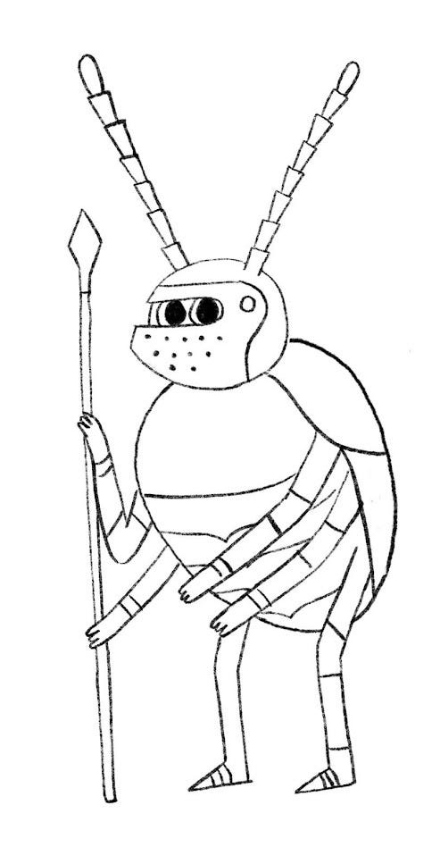
You’ll see me starting from the thumbnail sketch and working out the details, sometimes using drawings I did earlier on in the process as reference, like the character design sketches I showed you in the first post of this series which can be seen popping up here and there in this first video:
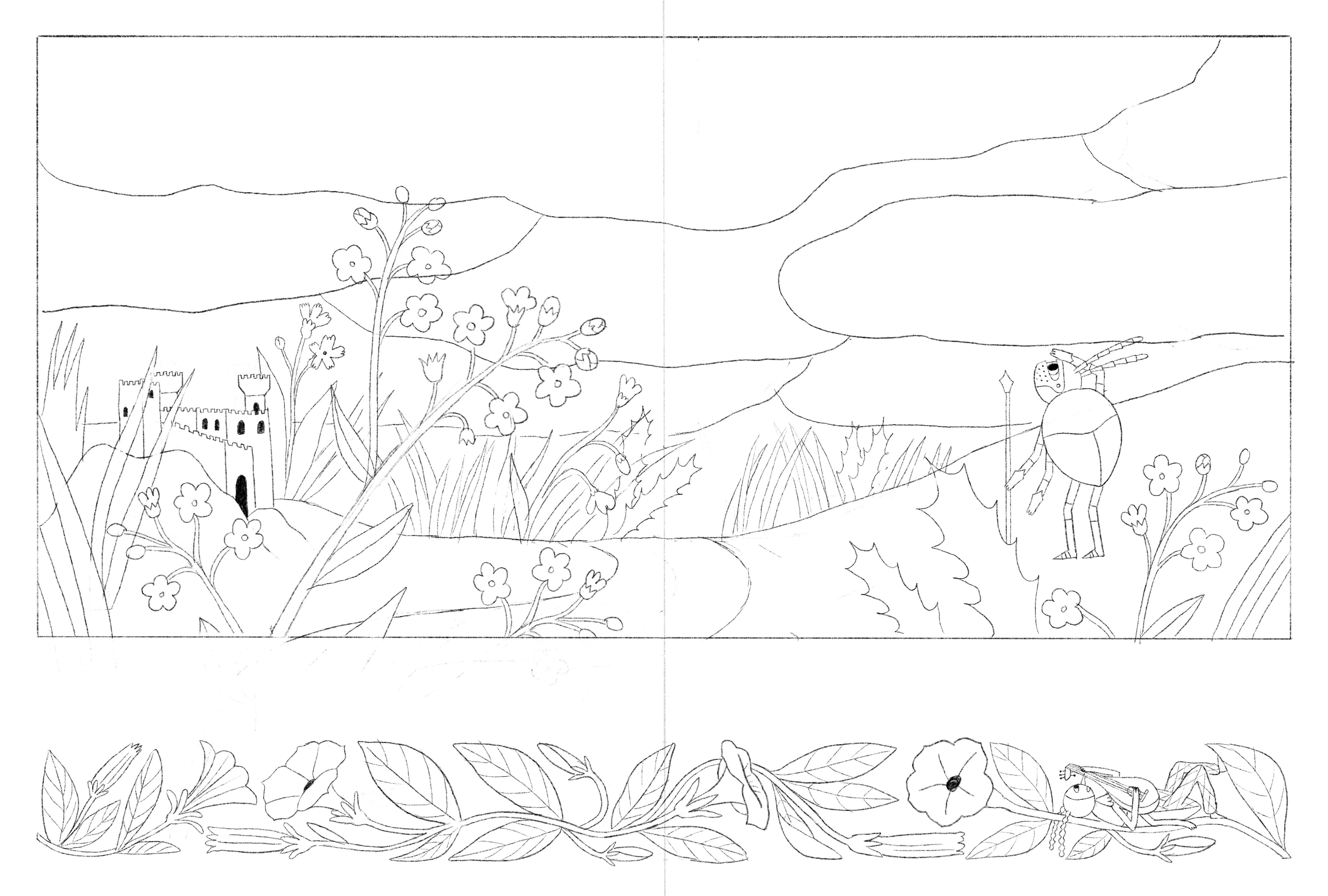
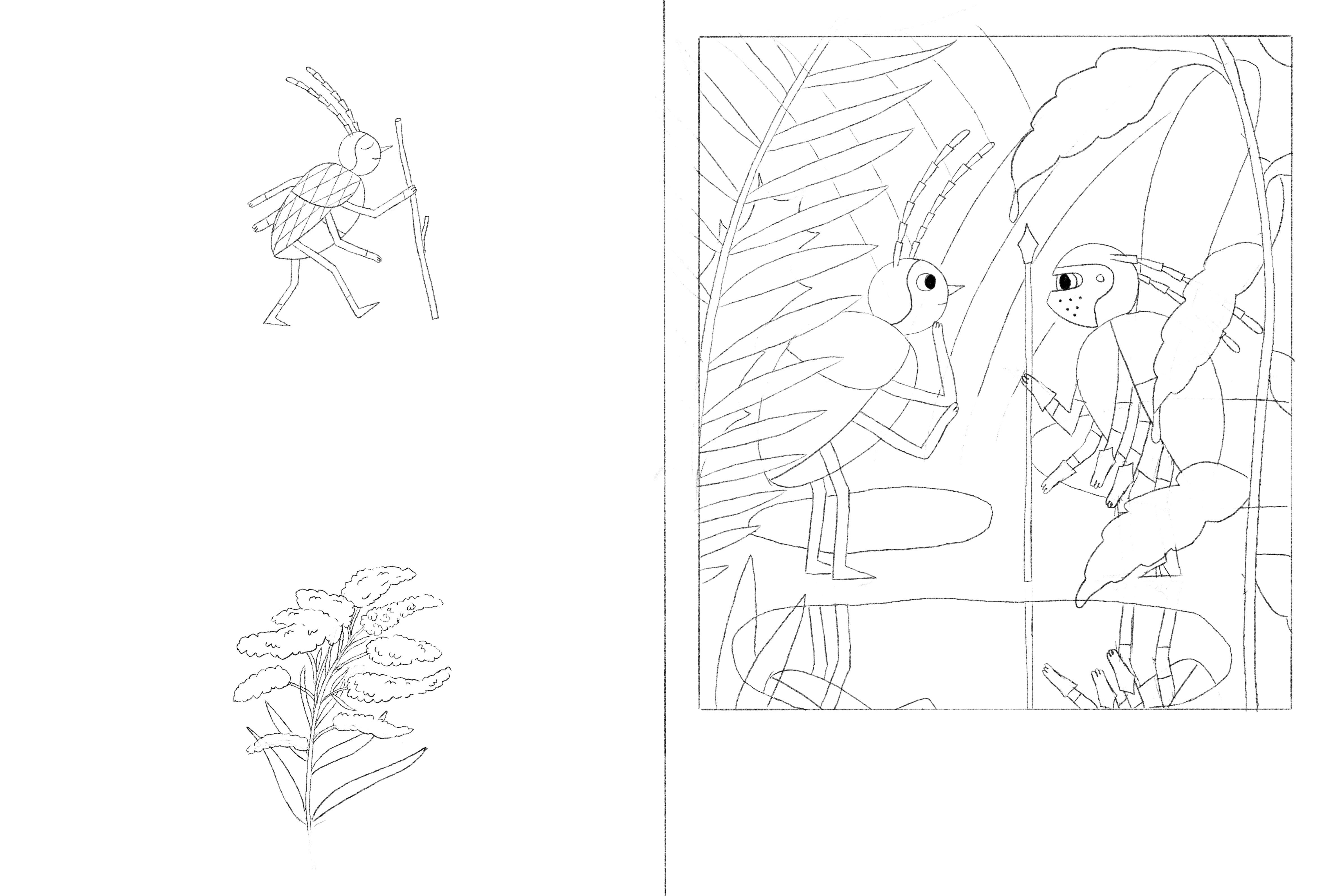
I also used photos and botanical illustrations as references, especially for the plants I included in the illuminations. You can see examples of that in the following videos:
As you can see, my sketches are very detailed and look almost like coloring pages. That makes the next steps easier, but I feel like it also can cut down on spontaneity in the finals. For the book I am currently working on (which I can’t wait to tell you more about!), I wanted to keep my illustrations a little looser: I did my sketches on paper and left them slightly unresolved so that I would have some things left to figure out and work through as I drew the finals. The drawings still aren’t quite as loose as I would like them to be - loosening up might be a lifelong quest.
Plant symbolism
I had a lot of fun choosing a different plant for each spread. I looked up the symbolism of various flowers and plants on extremely dubious websites to choose species that resonate with the events of the story and with Milo’s emotional state.
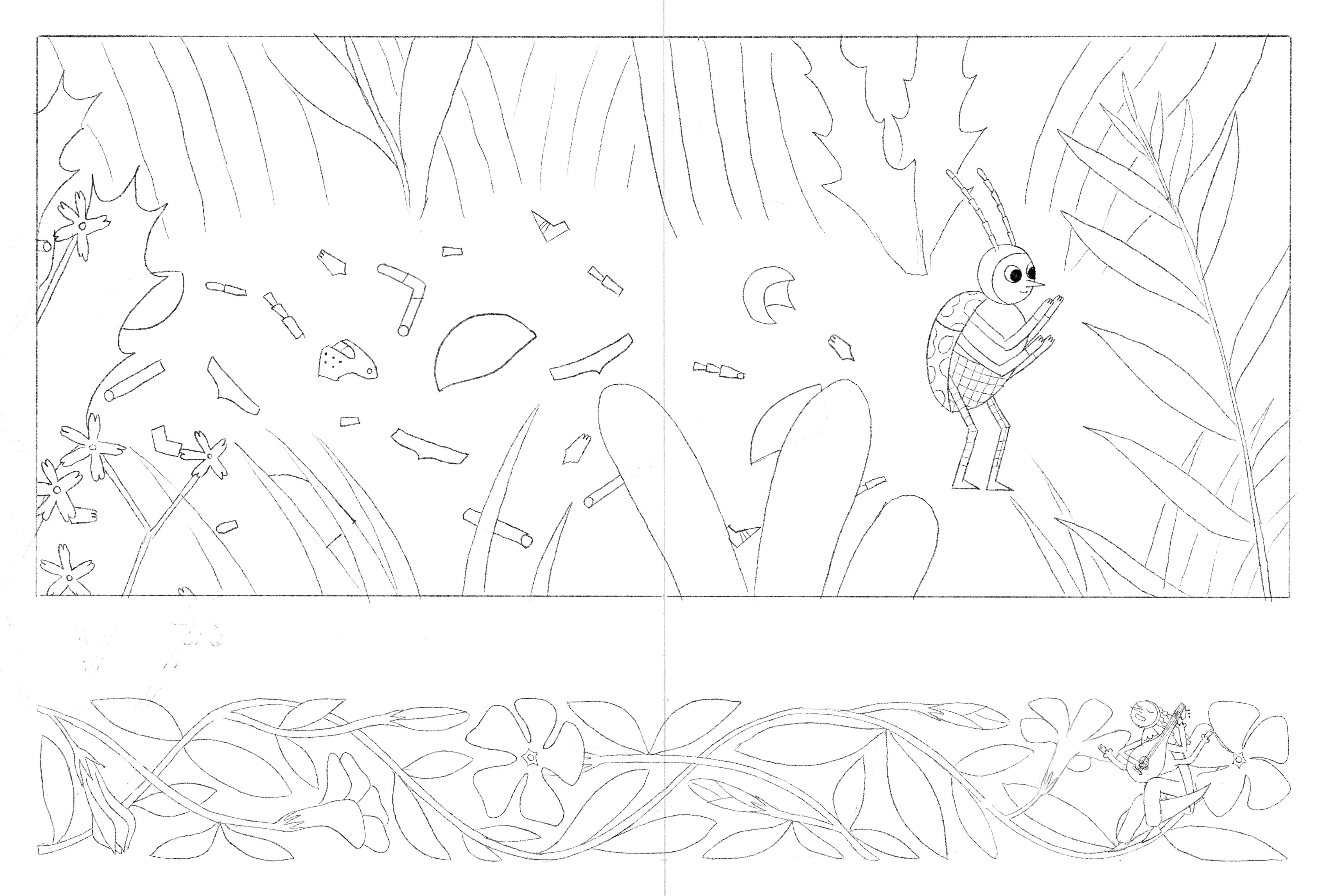
For example, I chose brugmansia (angel’s trumpets) for the spread where the reader is first told about dragons because that flower (apparently) symbolizes danger.
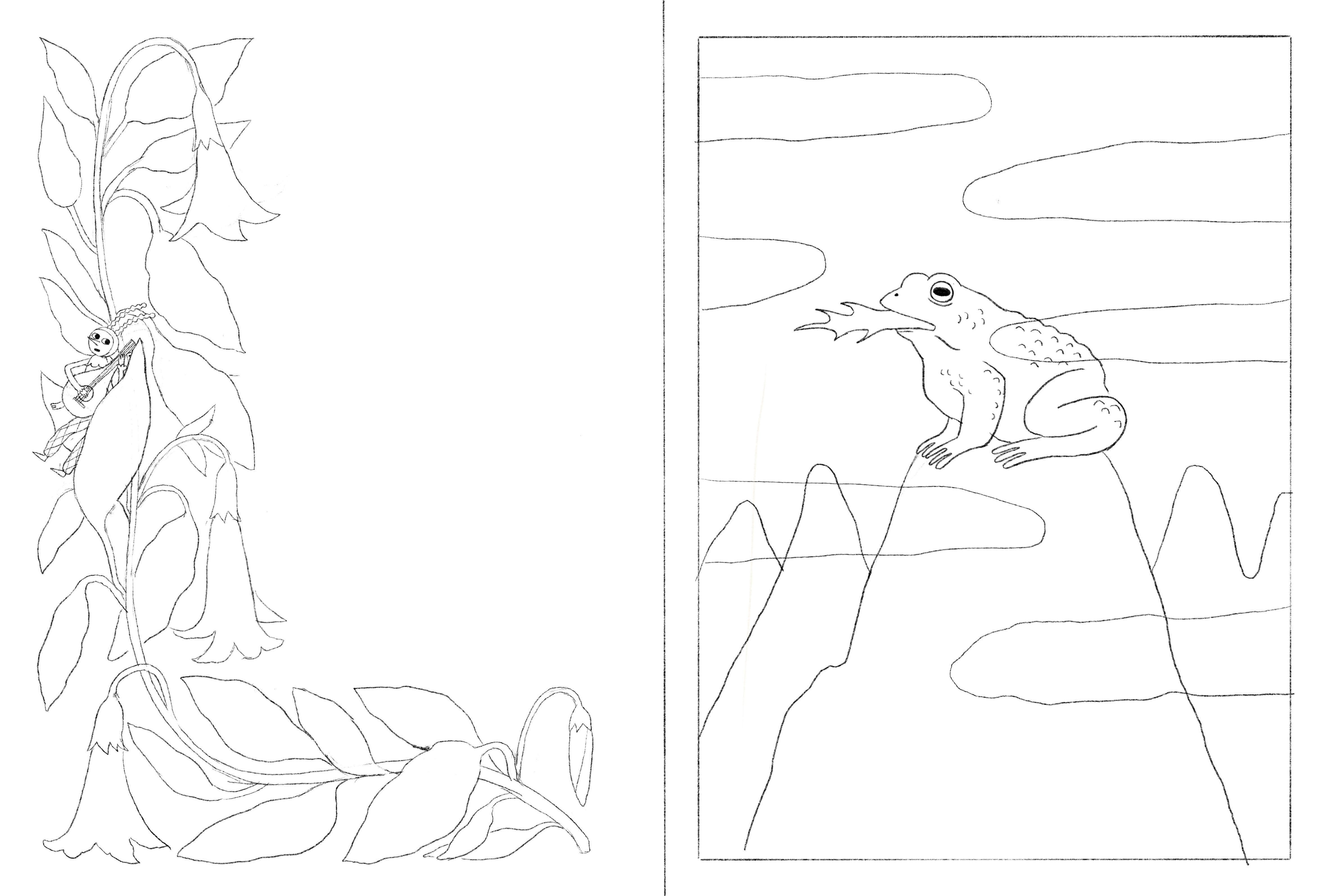
I chose petunia, which is associated with mystery, for the spread where strange clouds roll in.
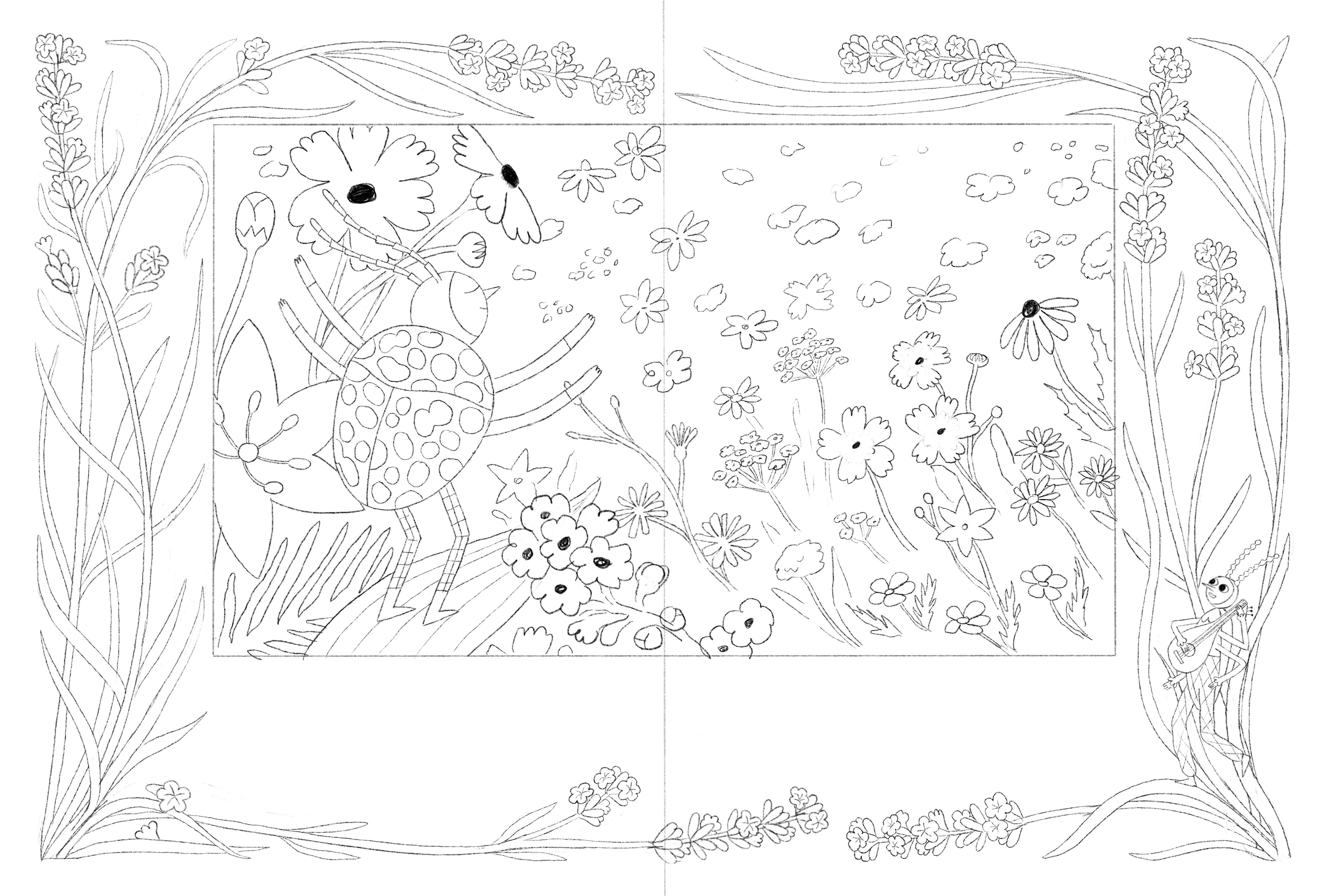
I included goldenrod on the spread where a jester appears like a deus ex machina to help Milo because that flower symbolizes good luck.
I drew calendula, which is associated with hope, on the spread where Milo lets himself be vulnerable and shed a tear.
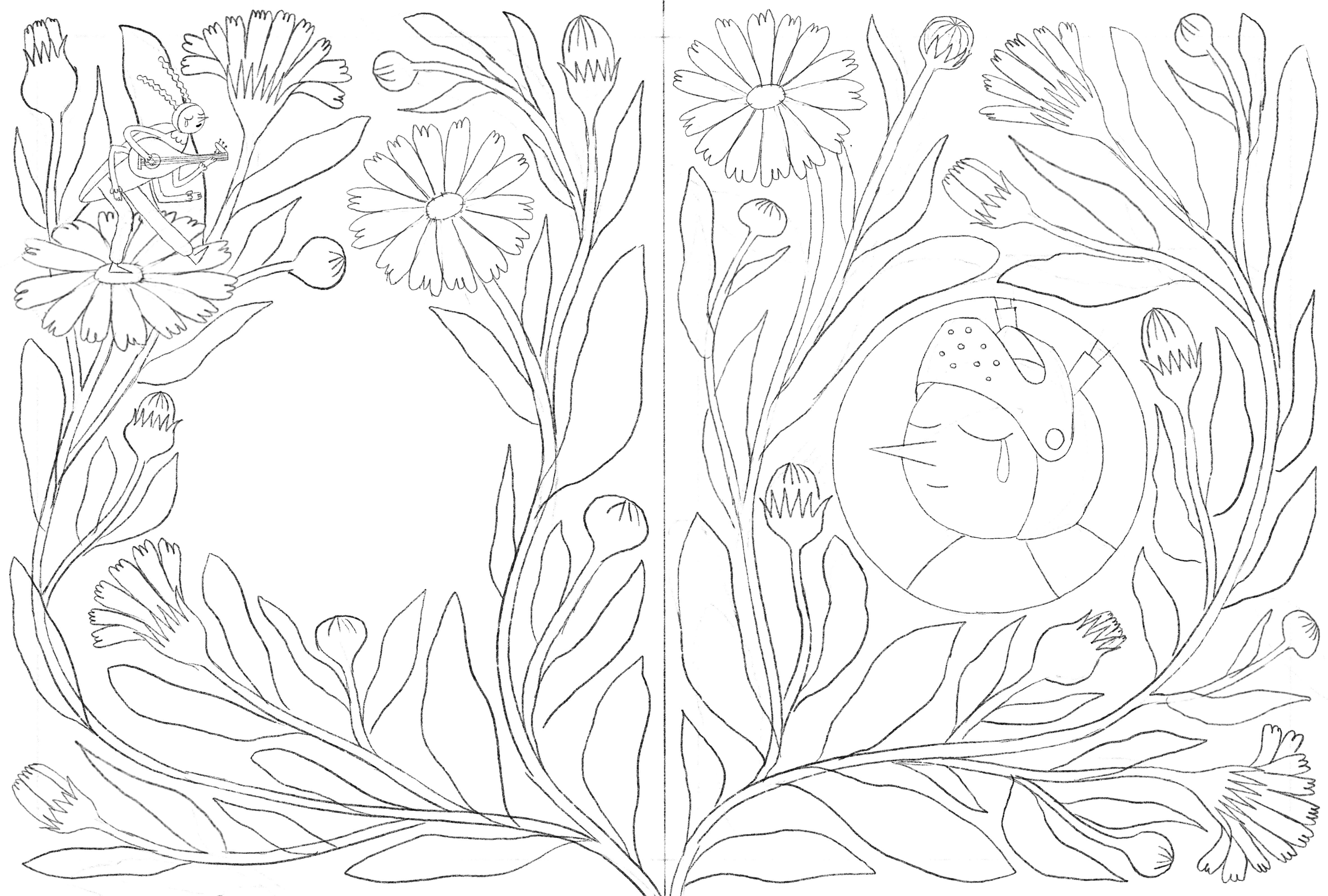
I chose periwinkle for the spread where Milo sheds his armor because some website said it was associated with serenity. Another website said it was associated with death, but I decided to trust the former.
And I chose another symbol of serenity and grace for the spread where Milo finally finds inner peace: lavender.
Medieval architecture
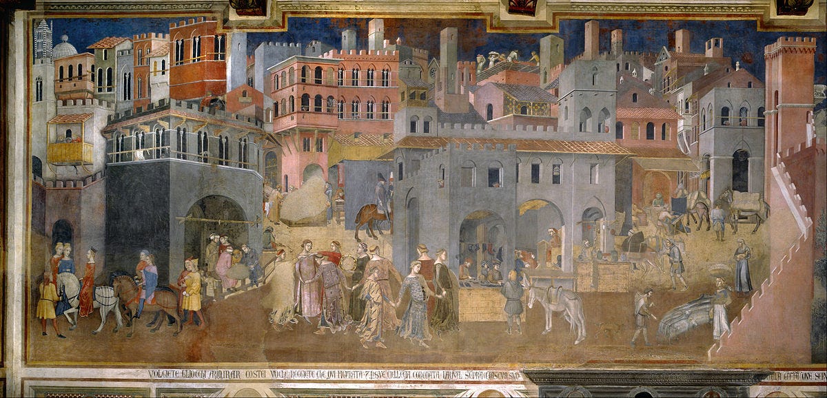
I had one main source of inspiration for the medieval architecture in the book: the frescoes of the Palazzo Pubblico in Siena, Italy. I was first introduced to them, and more specifically Lorenzetti’s Allegory of Good and Bad Government, in an Art History class about cities I took in 2017 during my undergraduate degree.

I loved it so much that I recreated the world of the fresco in my ceramics class that year:

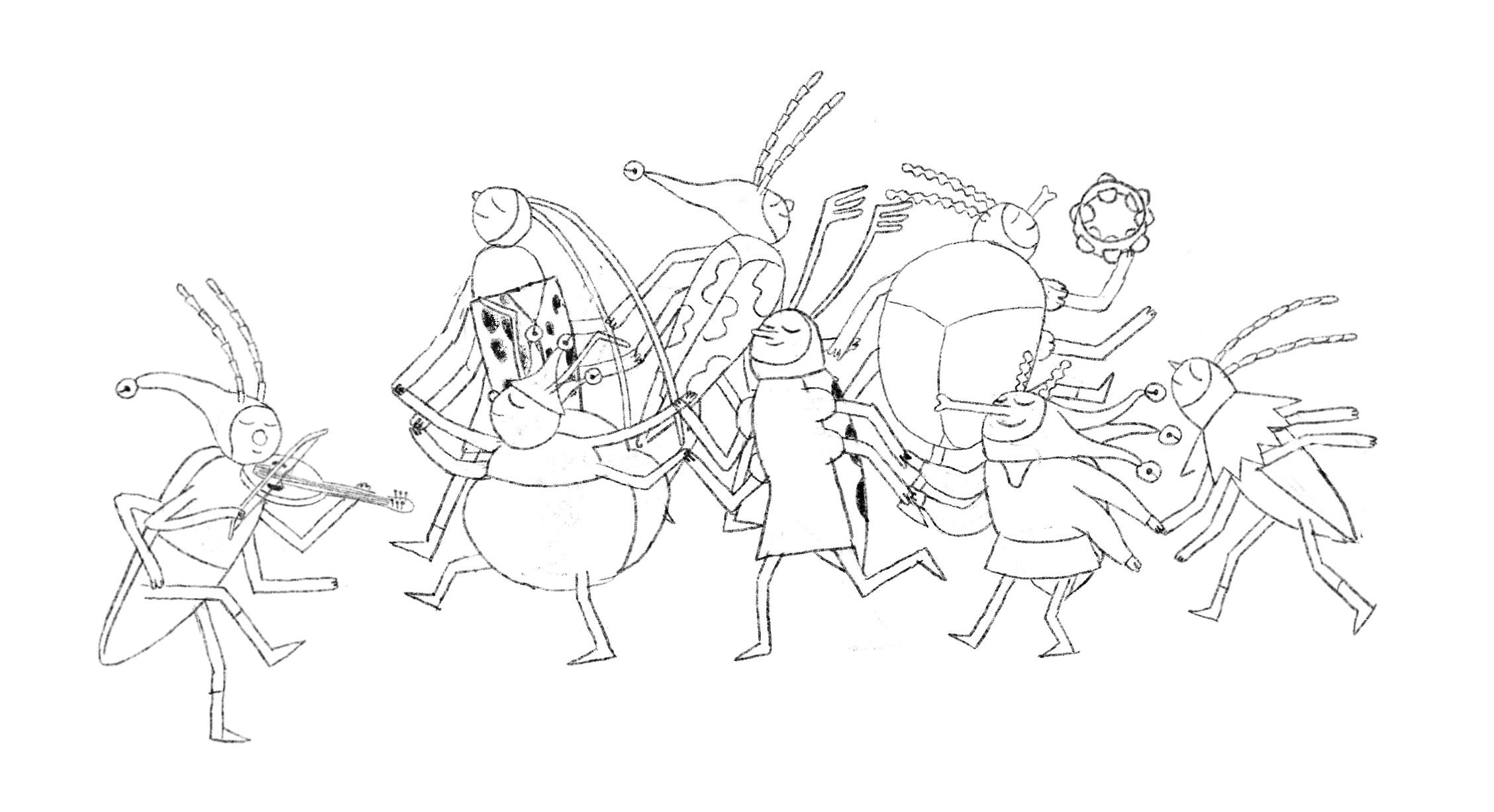
When I realized I needed a reference for a scene in a medieval city that included a group of dancers, I knew exactly where to look! It was a real joy to spend some time with the Allegory again.
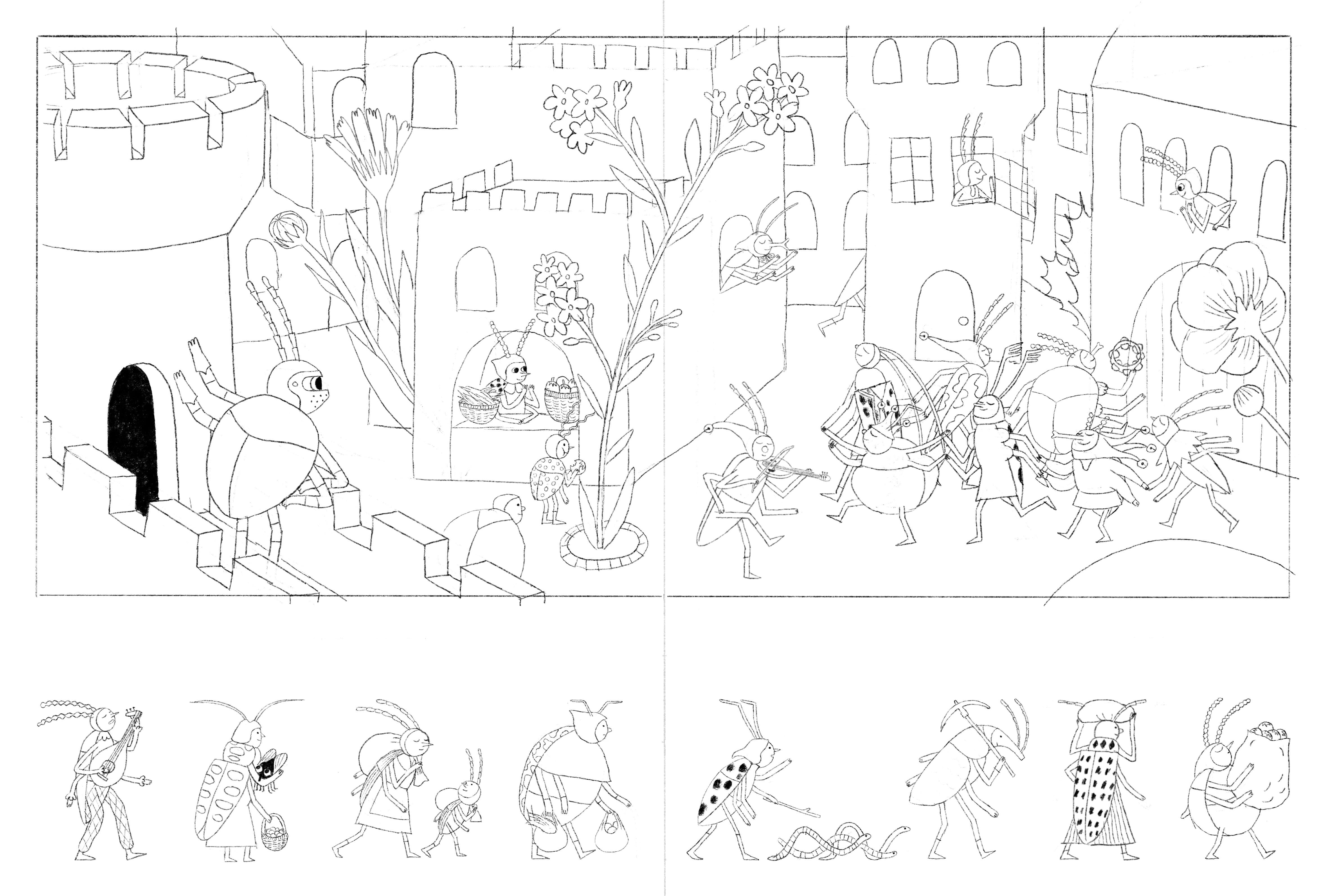
Here is the city scene in the fresco and that of Milo the Knight. The tribute is self-evident, I think (I flipped the composition for the needs of the spread, but the buildings are very similar - though simplified). Even some of the villagers in the bottom border are inspired by characters from the painting.
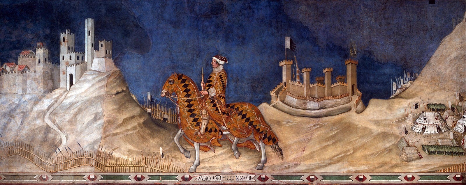
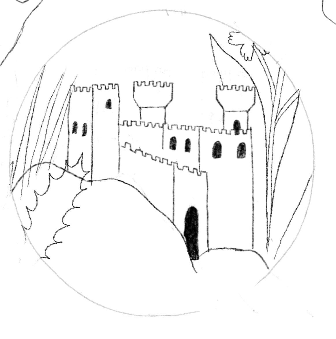
I looked at another fresco from the Palazzo Pubblico as a reference for the castle, this one attributed to Simone Martini. Milo’s castle is based on the castle on the left.
Where’s the narrator?
As you have probably noticed by now, the narrator is present on most spreads, usually in the decorative borders.
He is very engaged in his telling of Milo’s story, as I hope you can see from the occasional tear or worried look on his face.


I like him a lot and finding just the right spot for him on each spread was a fun challenge. I hope children will have just as much fun finding him hiding in the illuminated borders in the book.
Once all of my sketches were completed, I was ready to move on to thinking about color. We’ll discuss creating my palette and making digital color compositions in the next post. Make sure to subscribe so you don’t miss it:
As a reminder, Milo the Knight is available for preorder:
As always, thank you for being here. You’re the best.
J'adore voir le 'behind the scenes' et l'ampleur de la recherche qui entre en jeu dans tes illustrations. Et c'est vraiment cool de pouvoir voir les timelapse des dessins!
This is fantastic, Charlotte! I love reading about your wonderful attention to detail.