


Milo: The Process - 7. Final illustrations
My picture book process for MILO THE KNIGHT, Part 7

This is the seventh post in a making-of series about my upcoming picture book, Milo the Knight, written by Grégoire Laforce, coming out in English on October 15th (that’s next week!). You can preorder it here:
It comes out in France TODAY! Find it here:
It will be in bookstores in Quebec in French on October 16th. You can preorder it here:
In the last post, we looked at how I pick my palette and plan my use of color. Once that was done, I had no excuse: it was time to tackle the finals! I sat at the drawing table all day for months, toiling over my illustrations like a medieval monk.
My scriptorium
Just kidding, I call it a studio.
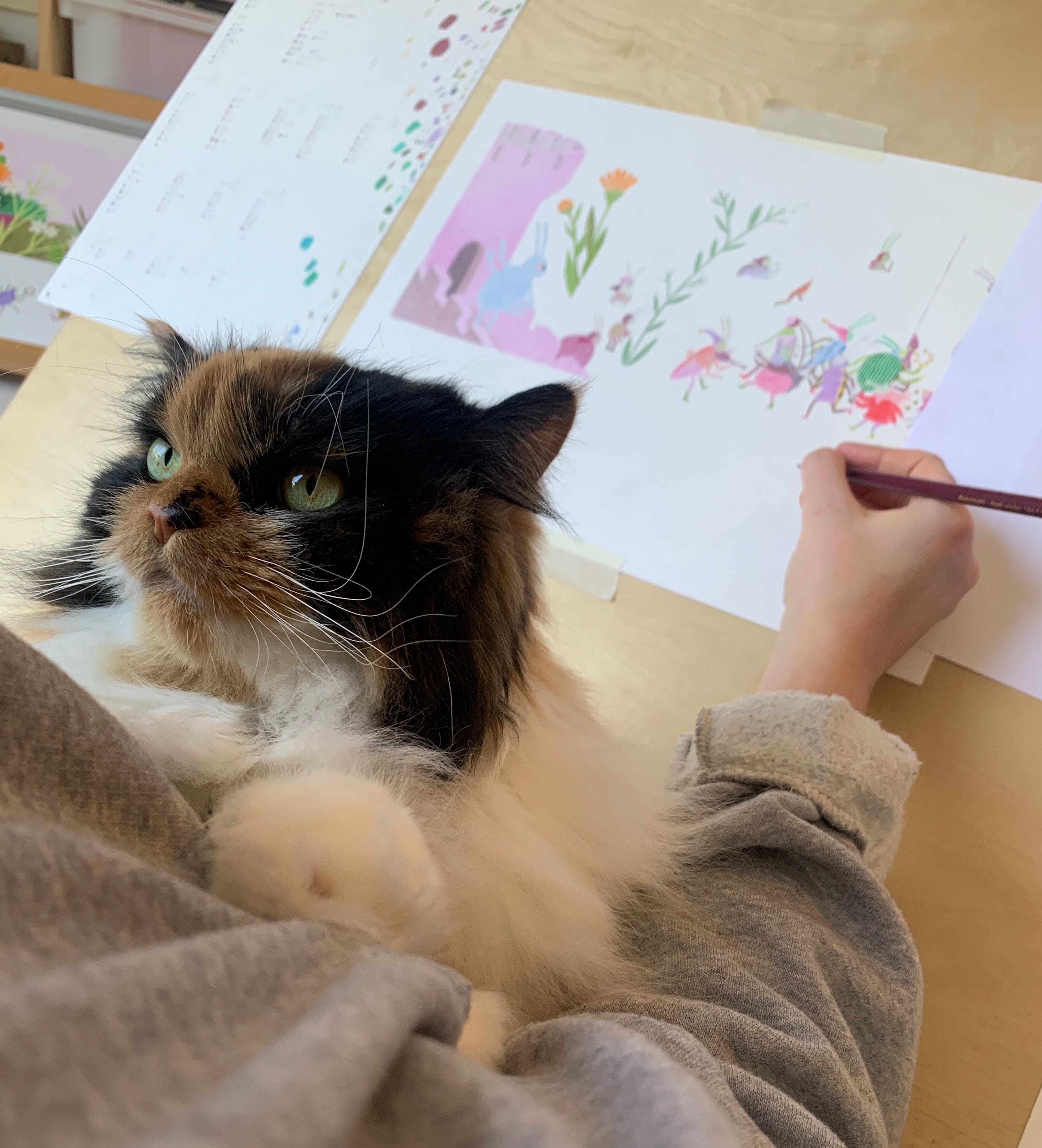
I illustrated this book in my home studios in Montreal and in the country (in Centre-du-Québec), under the supervision of my cat.


Materials
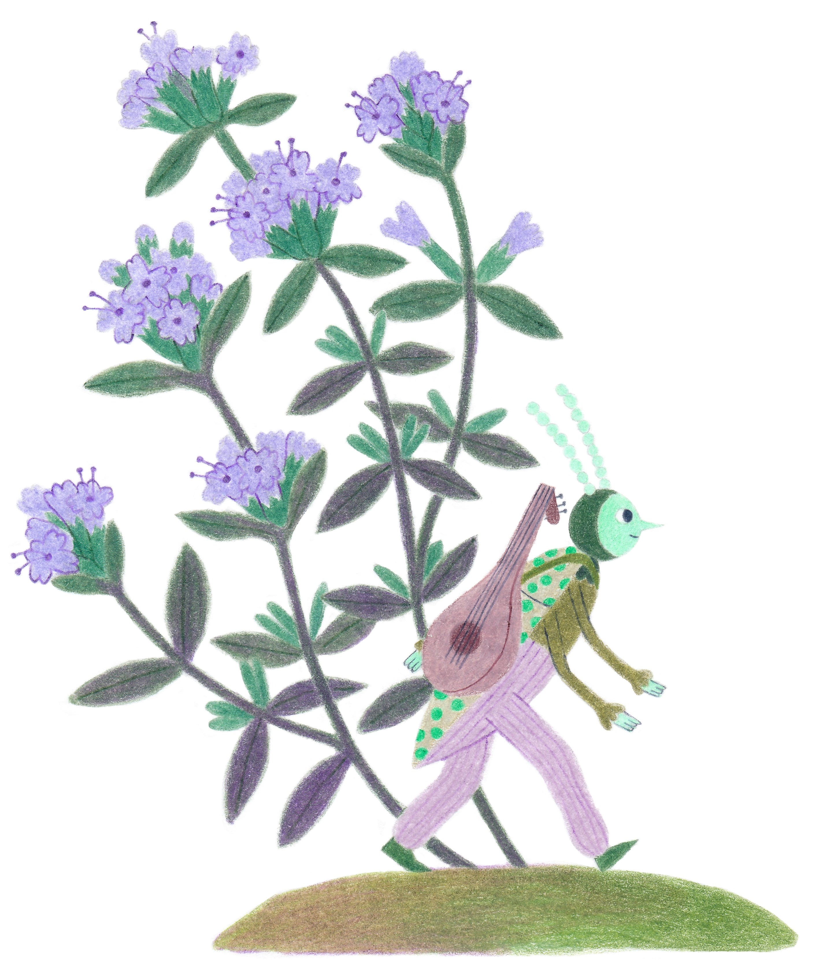
I drew the illustrations for Milo using colored pencils on paper. The colored pencils I used were Faber Castell Polychromos with some Caran d’Ache Luminance, and two or three Prismacolor Premier pencils. I used Smooth Surface Strathmore Bristol paper.
Process
I’ll show you all the stages of the process with (really poorly lit) photos of one spread. I also included a video showing my process at the end of this section!
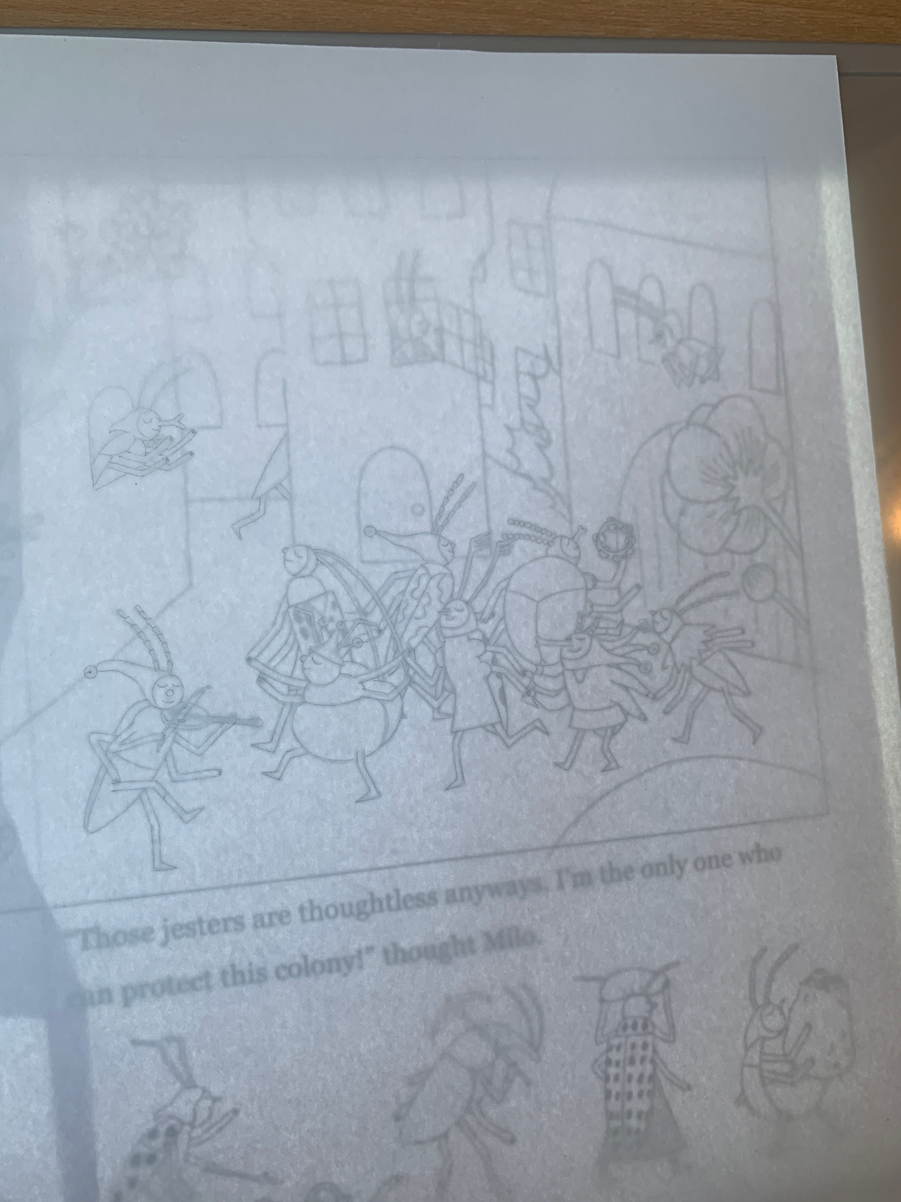
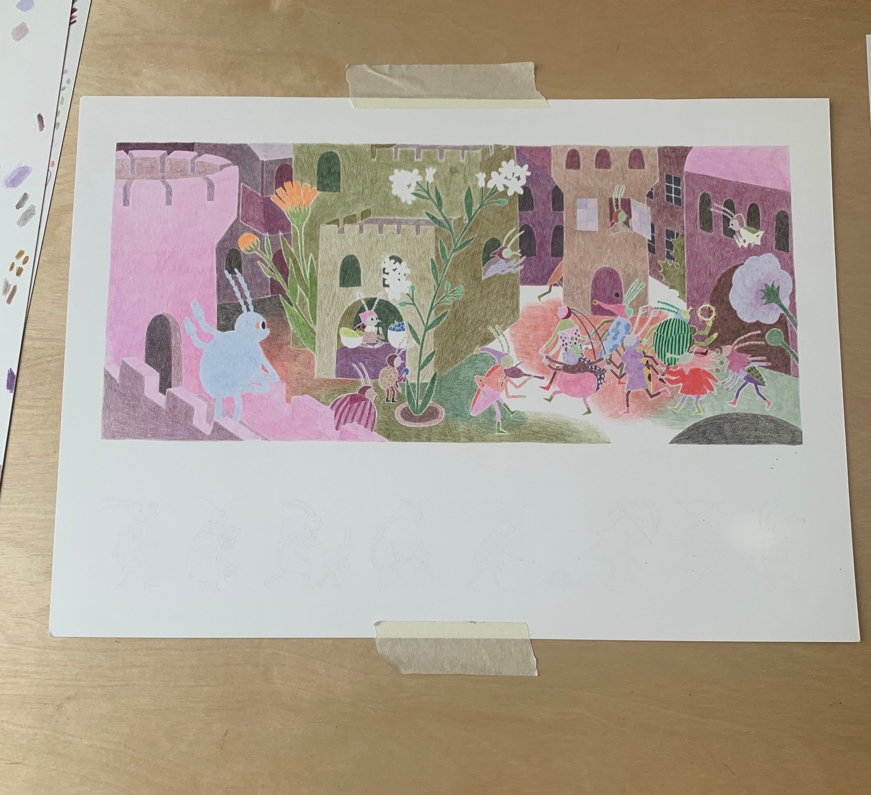
First, I print out the detailed sketch. I used to draw my illustrations on paper at print size, but I decided to draw them at a slightly smaller scale this time - I printed the sketches at 90%. I made that decision because I thought it would be interesting to blow up the textures a bit for printing, but also for practical reasons: at that size, the spreads would fit on a piece of 11x14” paper (so I wouldn’t have to cut 22x30” sheets) and the single pages would fit in my scanner - those are the little things that make the process easier!
I use my light table to trace the sketch.
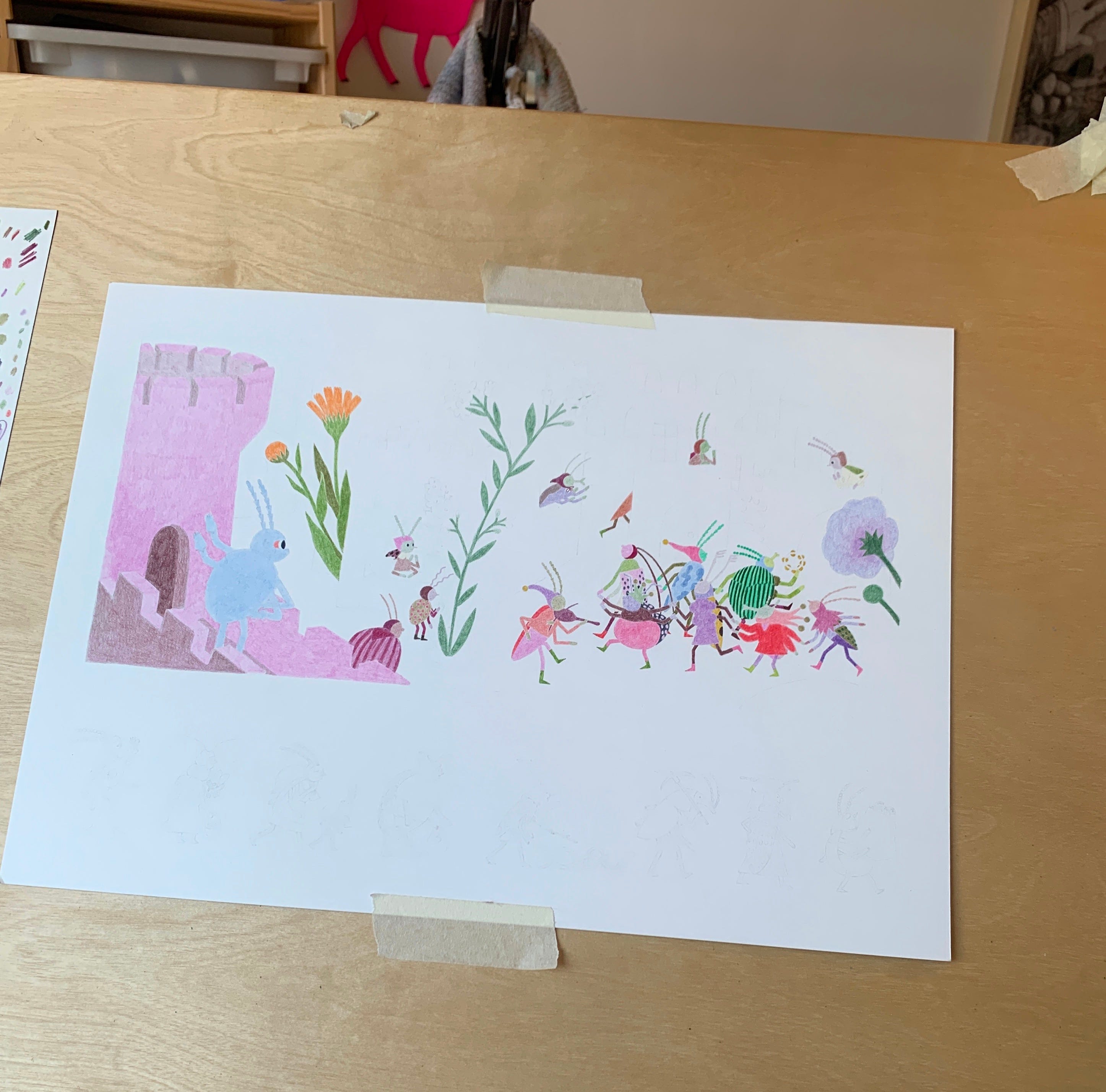
Then, I draw the characters and elements of the foreground, using my digital color comps as reference.
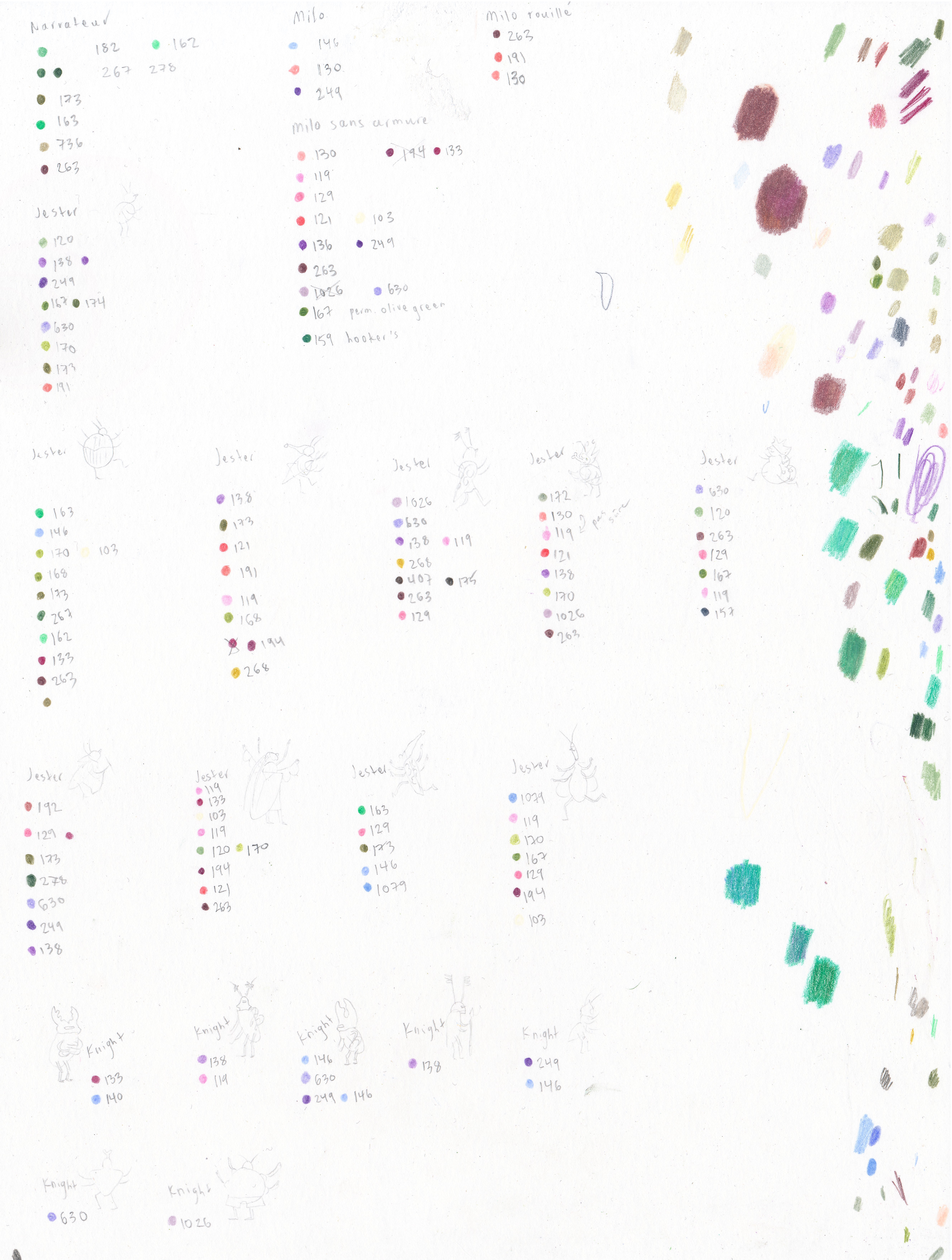
To keep track of the colors for each character and ensure that they are consistent across the whole book, I created a key for myself:
Then, I draw the background. Here, you can see that I drew the buildings, then the ground (still in progress in the photo below). I like to go from foreground to background. That allows me to adjust the background colors so that they contrast in hue and value with the colors of the different elements in the illustration.
Once I am done with the colors, I whip out my Caran d’Ache blenders!


Blenders are just the wax-based binder of the Caran d’Ache pencils without any pigment. I use them all over my images. They’re kind of the Secret Ingredient. They blend colors together, enhance saturation, and create a texture I really like (with less of the white of the paper showing through the pencil marks). Some people have mistakenly described my colored pencil illustrations as pastel illustrations - I think the blender is to blame! It gives pencil illustrations a smooth smooth texture.
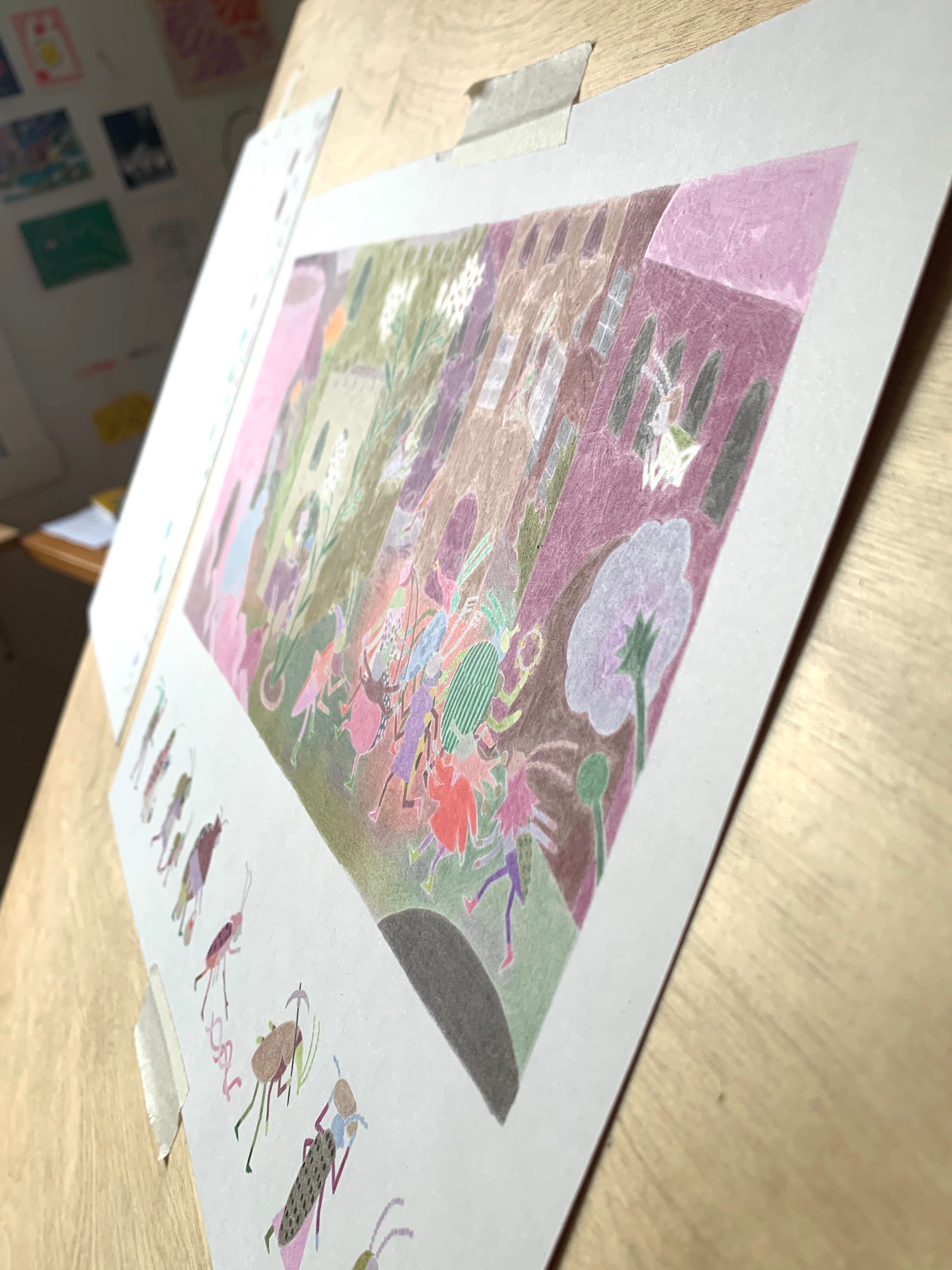
When I am done, the whole illustration is “locked in”. Pigments can’t be moved around on the surface of the paper anymore. When you look at the drawing from certain angles, you can see how shiny it has become:
It’s harder to add to the drawing after I’ve blended all the colors because the surface of the paper becomes so saturated. All I add after this step is the linework (facial features, details in the clothing, etc.), which I can’t add before because the blender would mess it up.
When I am done with the illustrations for the book, I scan them in!
I scan them at home on my A4 flatbed scanner. It’s a Canon 9000f Mark II - it’s almost 10 years old and that model is discontinued now. It still works perfectly and I am in no rush to shop for a new one, so I hope it keeps going strong for a long time! Because my illustrations are often larger than the scanner bed, I scan them in sections and stitch them together in Photoshop (there’s an Automate action for that, and it works well). Then, still in Photoshop on a Cintiq, I carefully zoom in and clean every little speck of dust and cat hair on the image. That takes a really long time.
I try to keep digital edits to an absolute minimum, but if I have to modify anything digitally, I do it in Procreate on my iPad. I can’t draw on Photoshop - I wish I could!
For example, in the illustration below, I got Milo’s gauntlets wrong - I forgot they were pointy at the wrists! I also gave the first line on his abdomen a weird angle. I corrected those two things in Procreate.


Then I send the final files to my editor!
Here is a video of me drawing another of the illustrations for the book:
Aaaand that’s it! Drawing the finals takes a long time (months!) but I do it while listening to audiobooks and podcasts, and it’s a very enjoyable process.
Let me know in the comments if you have any questions about my process or if I forgot any step you would have liked me to cover. I tried to make this post as specific and technical as possible, for all of you process nerds out there (my people!).
In the next and last part of this series, we will look at the design of the covers and endpapers. Subscribe so it lands in your inbox in two weeks:
Thank you for being here!
Absolutely stunning pencilwork! Amazing x Nell.
Tellement généreux de partage et fascinant de voir ton processus! Merci Charlotte!!
One mystery remains: how do you get your pencils so pointy!!? :D