


Milo: The Process - 6. Color
My picture book process for MILO THE KNIGHT, Part 6

Like many other illustrators, I have trouble explaining how I work with color. It’s a very intuitive process. While I can’t tell you why I make certain choices (how I pick my palette, for example), I’ll try and show you how I make them, in the hopes that that is in some way useful or interesting to you.
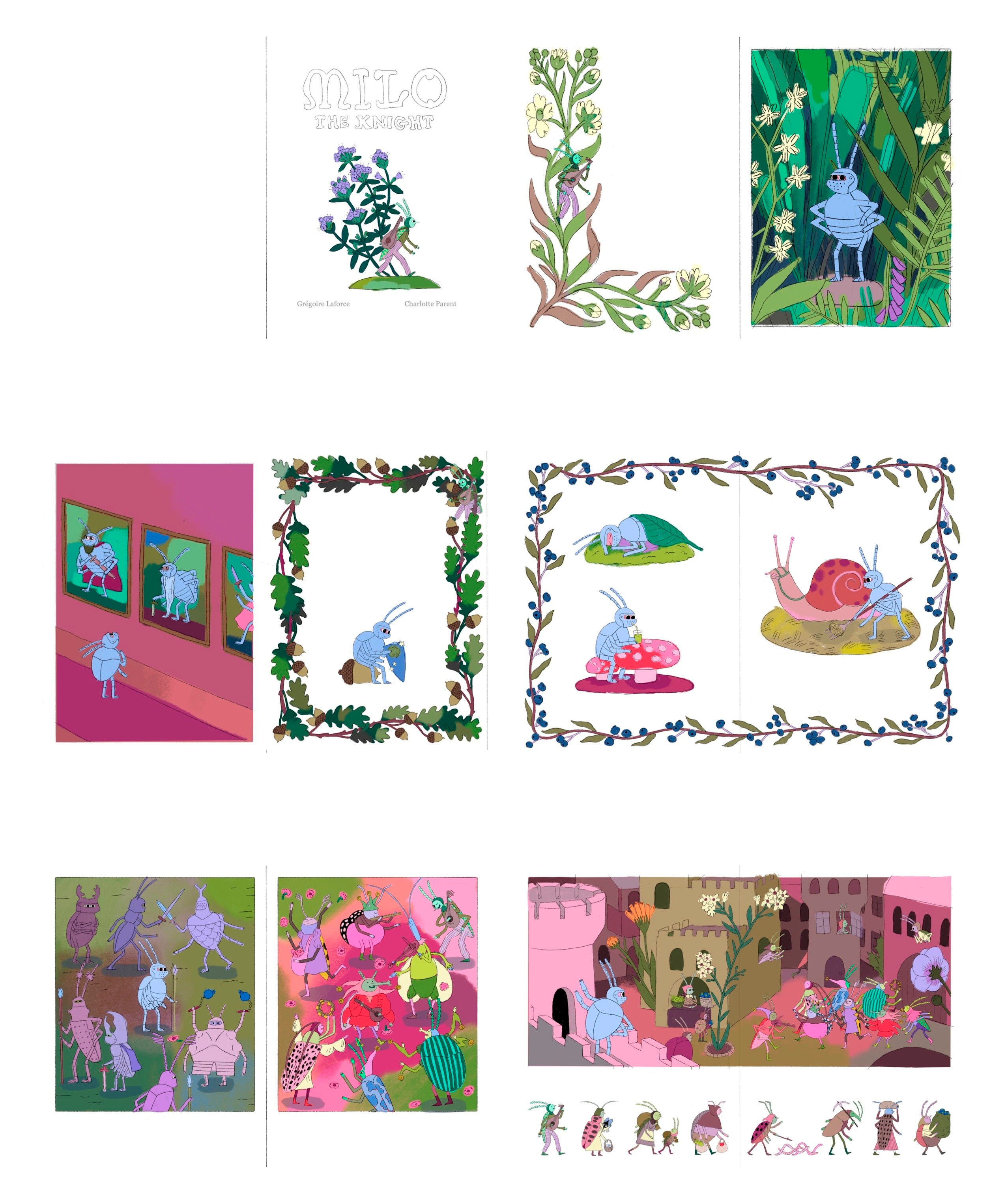
This is the sixth post in a making-of series about my upcoming picture book, Milo the Knight, coming out October 15th. In the last post, we looked at how I go from thumbnails to detailed sketches.
Picking pencils
I know it might sound simplistic and obvious, but picking pencils as I draw really is how I build a palette (the range of colors I use for a specific project).
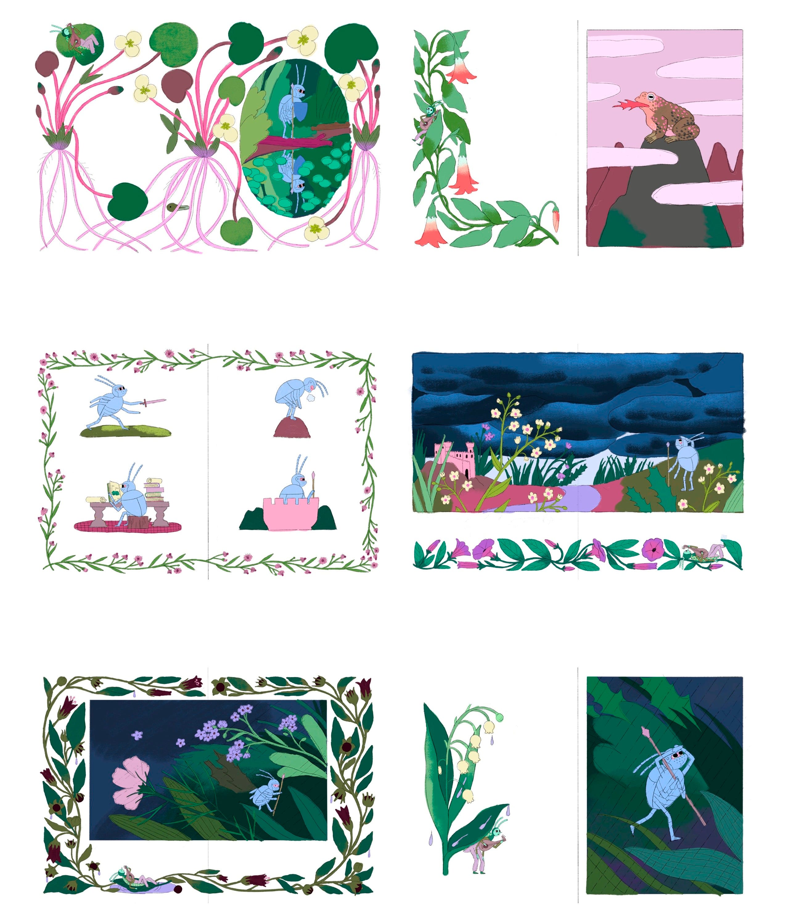
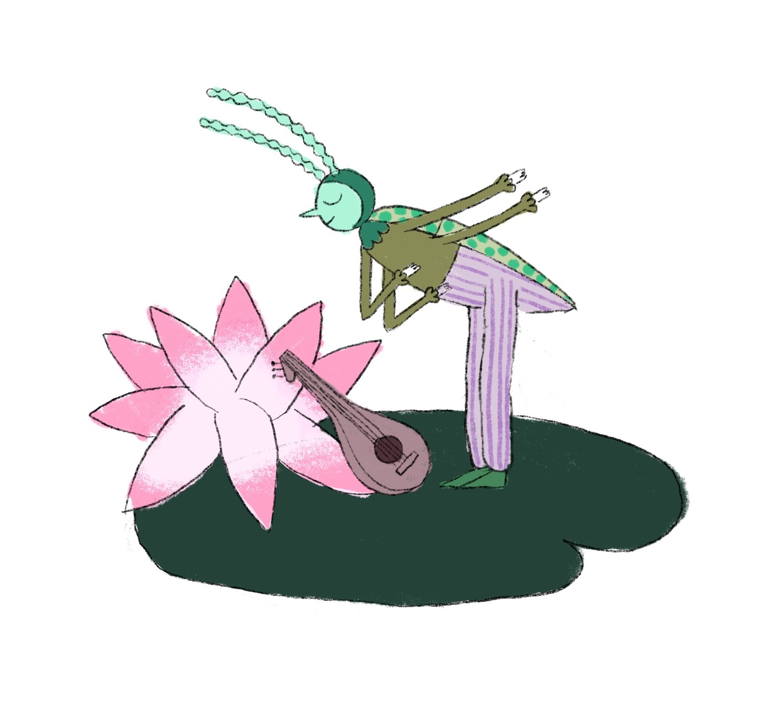
Early on in the process of working on Milo, I drew these beetles as a way to start thinking about the colors I wanted to use in the book:
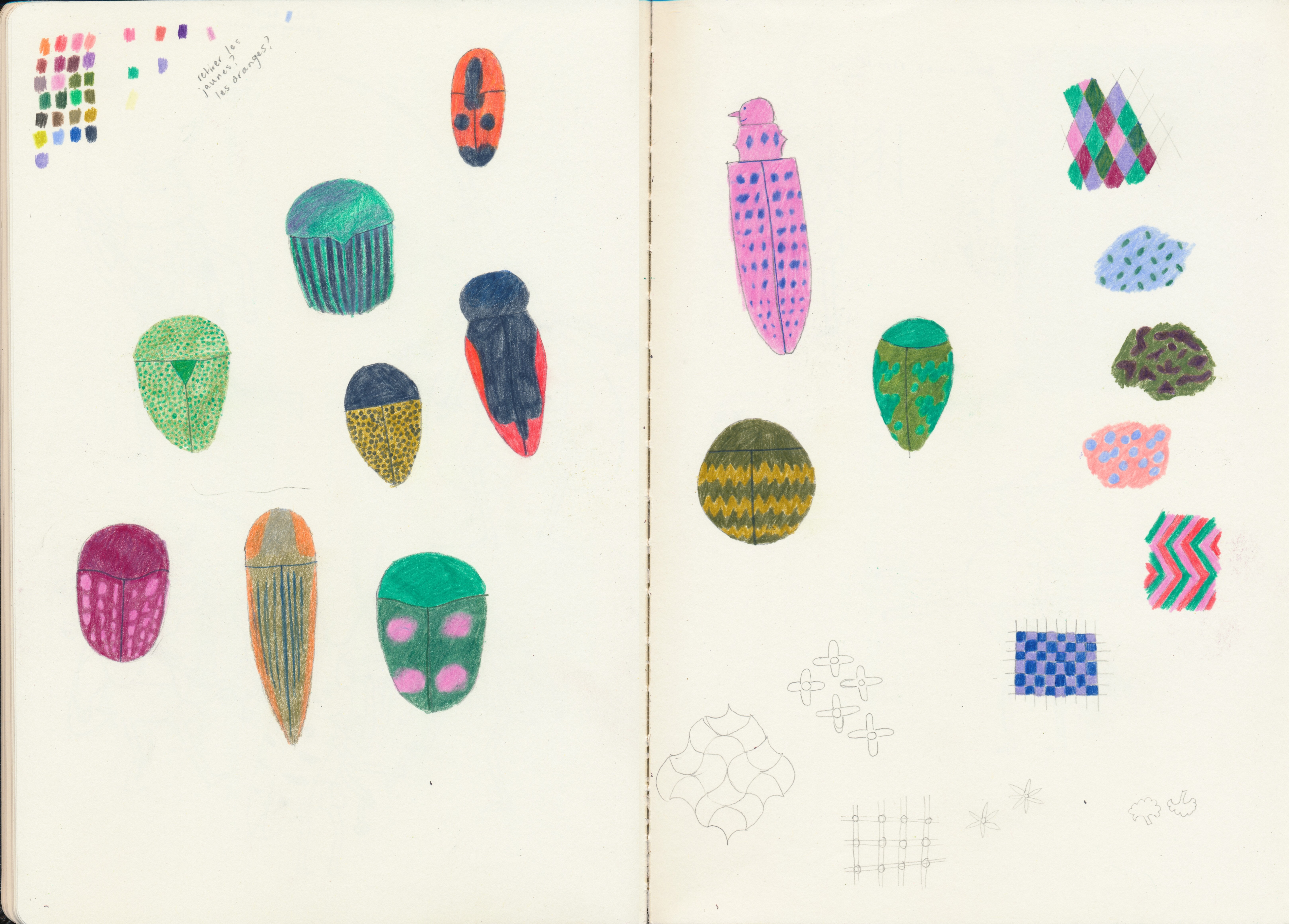
As I drew, choosing colors intuitively, I built up the little palette in the upper left corner and placed the pencils I used in a jar.
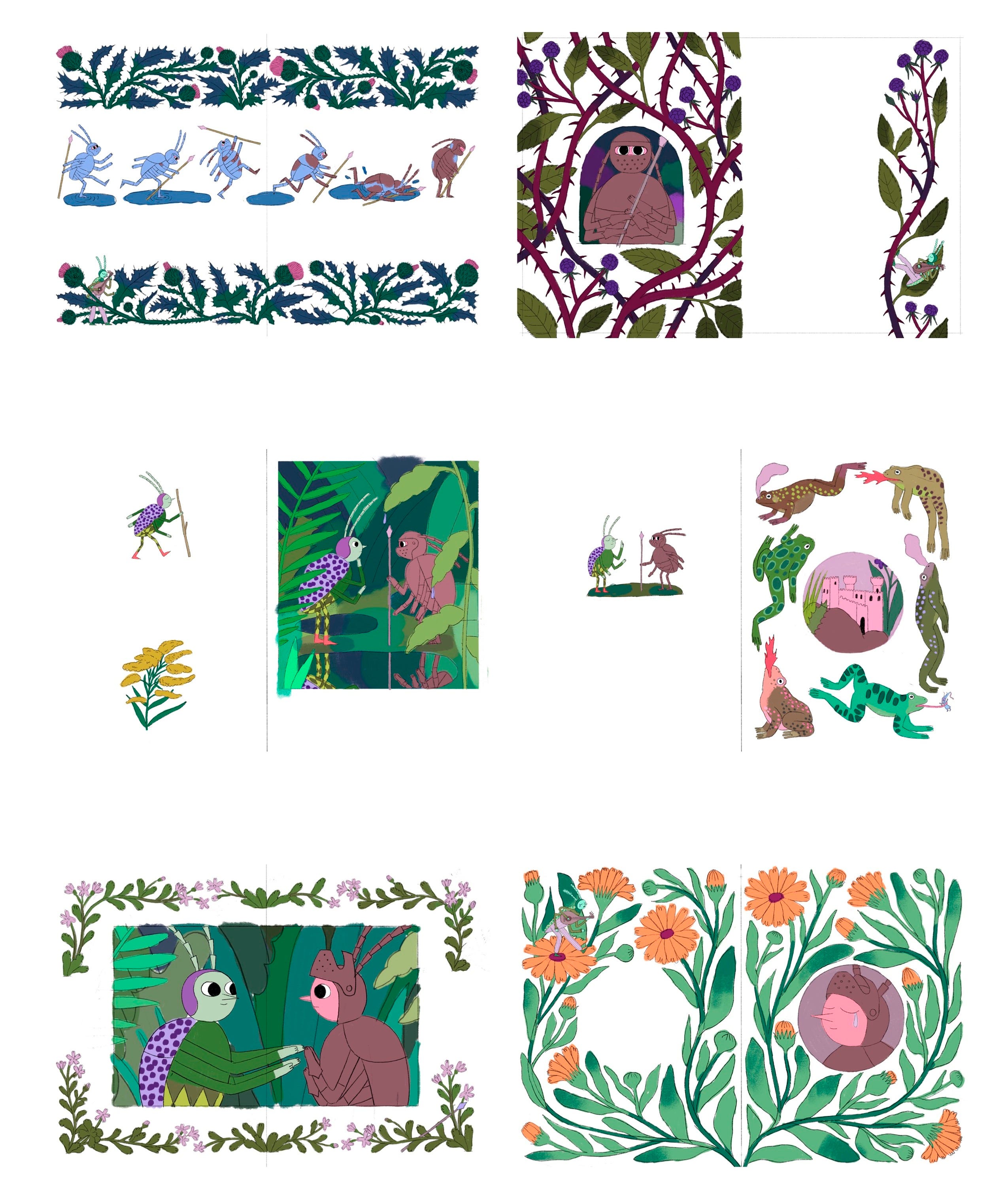
Later, I did my rendering test - a small version of a spread to define the rendering style for the book (and get it approved by my editor). I usually keep that test taped to my drawing table throughout the whole process of drawing the final illustrations as a reference.
Here is my rendering test (I used the first spread of the book):
I used the pencils I had previously placed in a jar (while drawing the colorful beetles in my sketchbook) to draw the rendering test, and added pencils to the jar as needed. That’s how I added colors to my palette for the book and ended up with this:
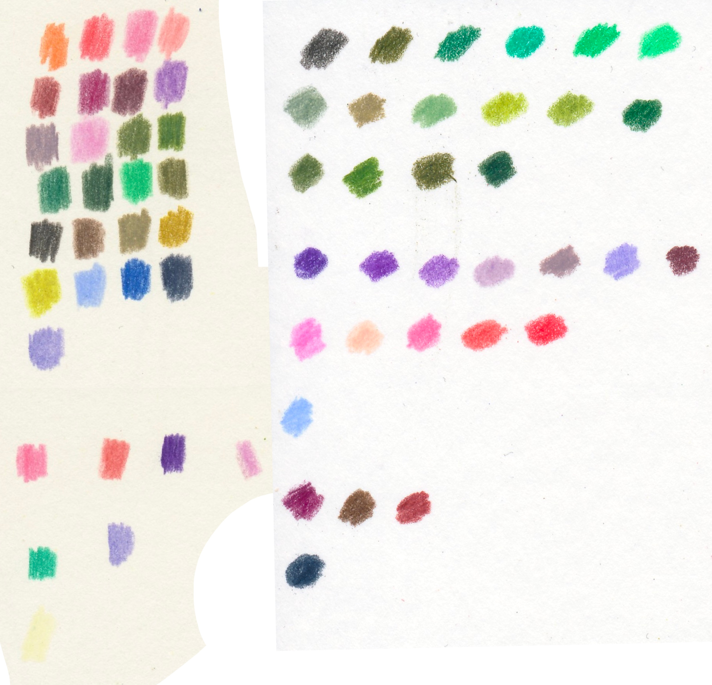
That palette is what I scanned in and used to create my digital color compositions!
Digital color comps
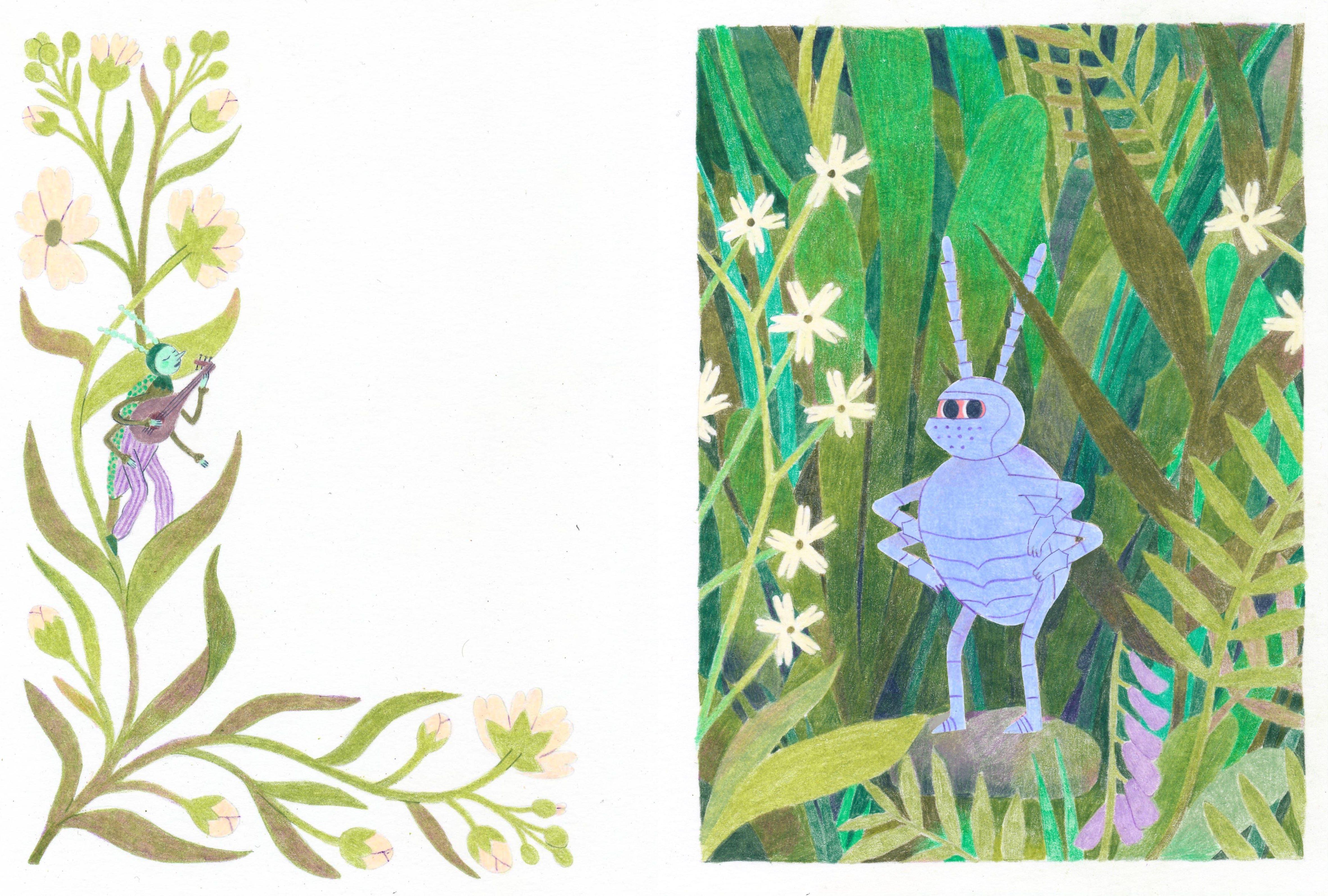
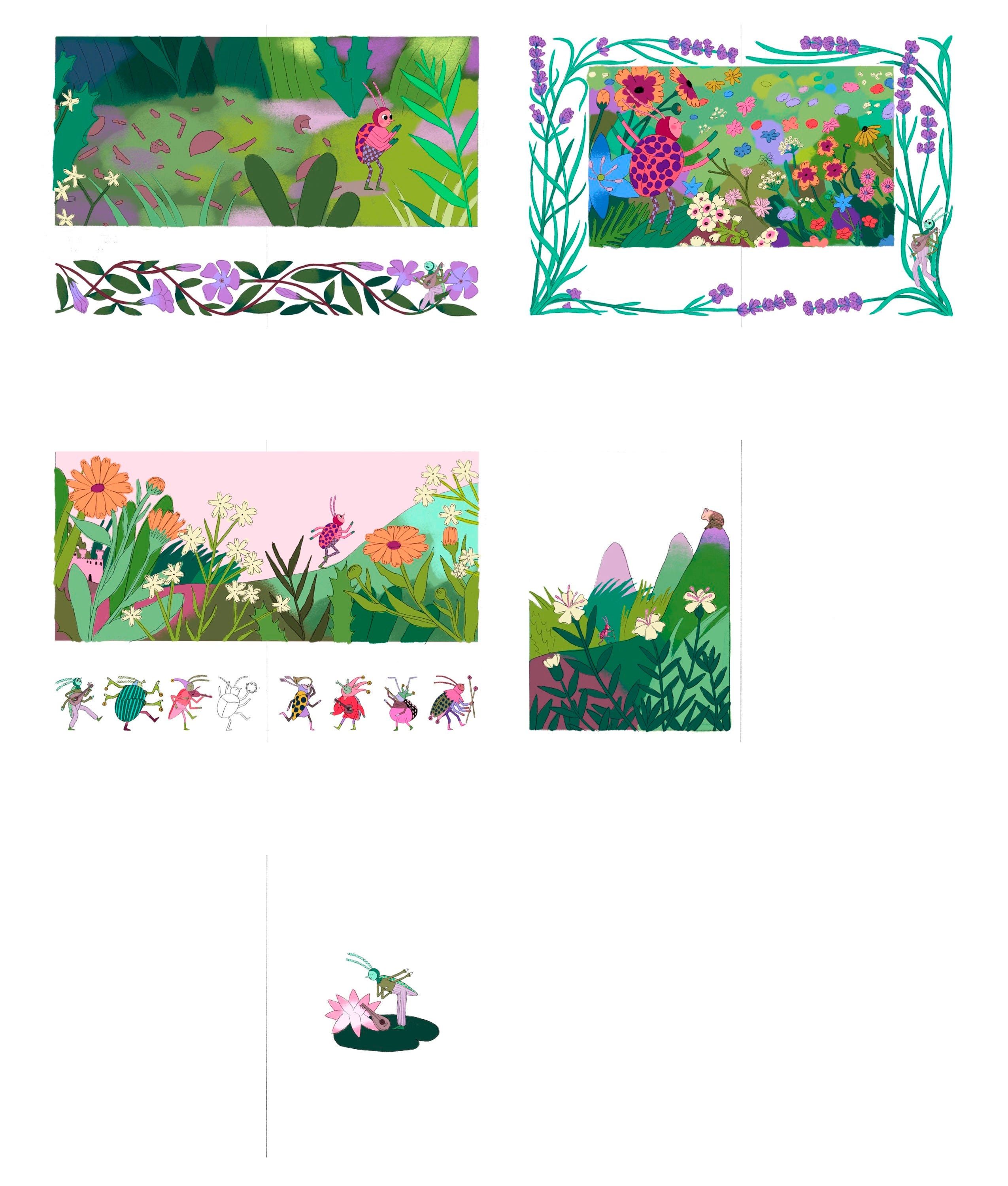
I use the detailed sketches and my palette to create color compositions for all spreads. I color the sketches digitally on Procreate, picking colors from the palette I scanned in. I like to get all of the digital color comps done before I start working on finals so that I can ensure the book has a coherent “color story”.
In the beginning of the book, the really bright colors, other than greens, are mainly present when the jesters are present. At the end of the book, those colors take over (especially in that scene with the field of flowers). Also, you can kind of tell where the drama starts and where it ends - there is a portion of the book with darker and cooler colors.
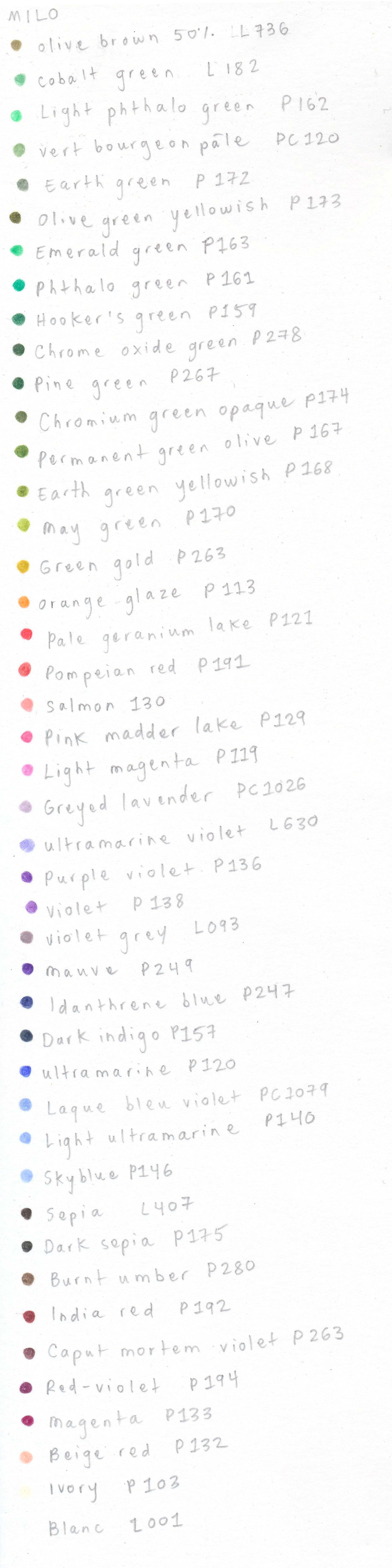
I ended up adding a few more colors to my palette as I worked on the finals. Here is the palette for Milo in its entirety, if you’re curious. I used different colored pencil brands: P stands for Faber Castell Polychromos, PC stands for Prismacolor Premier, and L stands for Caran d’Ache Luminance.
The next step is actually drawing the finals on paper!!! We’re almost there! (Not really - that last step takes months). Make sure to subscribe so you don’t miss the next post:
And, of course, please do preorder the book if you’re so inclined:
Thank you for being here. It’s nice to know I’m not sending these into the void.
Oh my gosh… how very apropos to my day right now 😂 I love seeing your process! Maybe I’ll do some digital color studies next..
The colours are incredible! Can’t wait to receive our copies.