

I finished this post by the light of the baby monitor. I’m sending it out now so that I stop fiddling with it. It took me a long time to write - mainly because caring for a baby slows things down, but also because this post involved a lot of thinking and reflecting. It’s on the long side. I hope it is of interest to you.

In the last post (months ago!!!), I tried to trace back where I found the inspiration for Murielle (my first author-illustrator picture book). Turns out, I think inspiration finds you more than you find it. And after it does, there is a lot of work left to do.
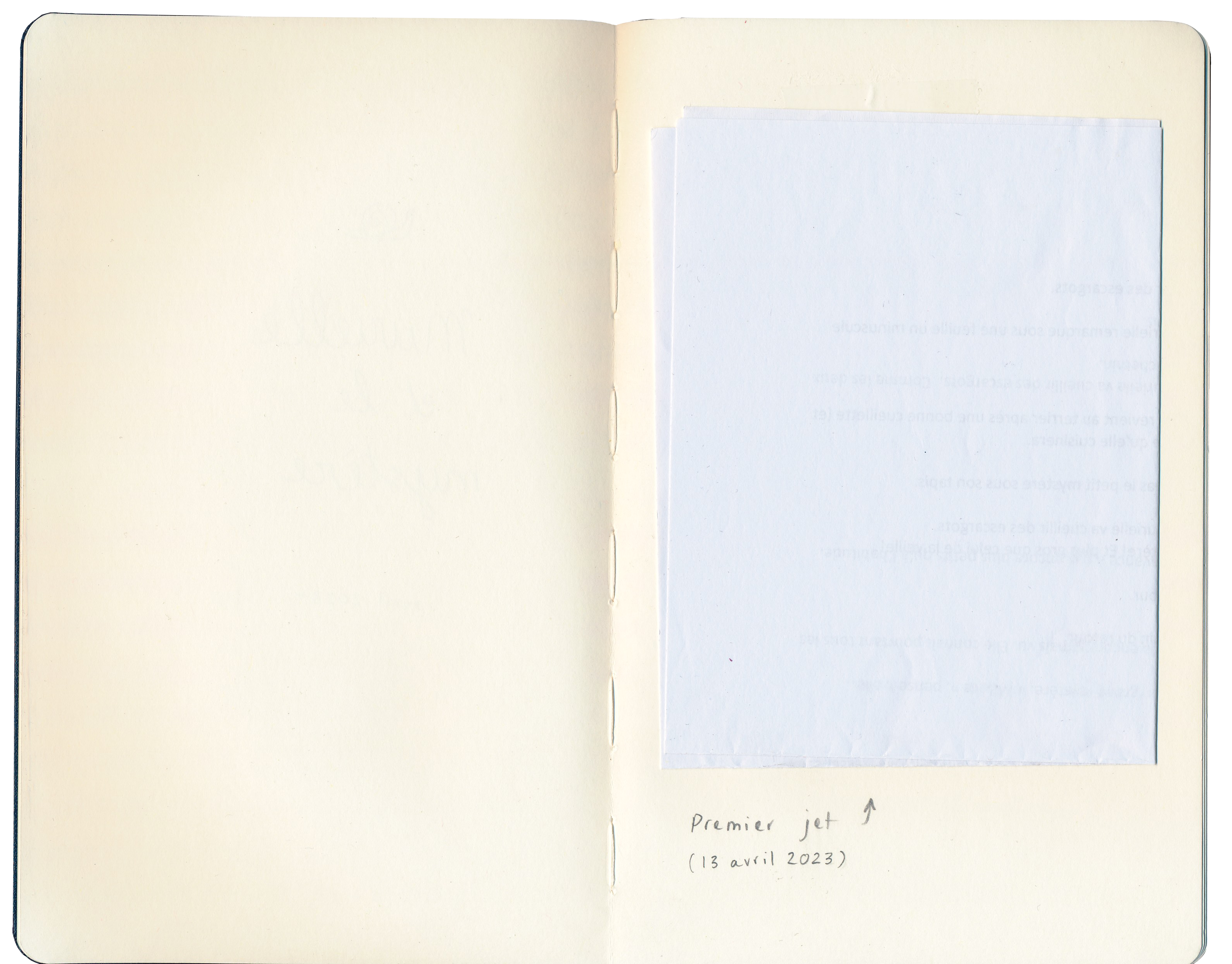
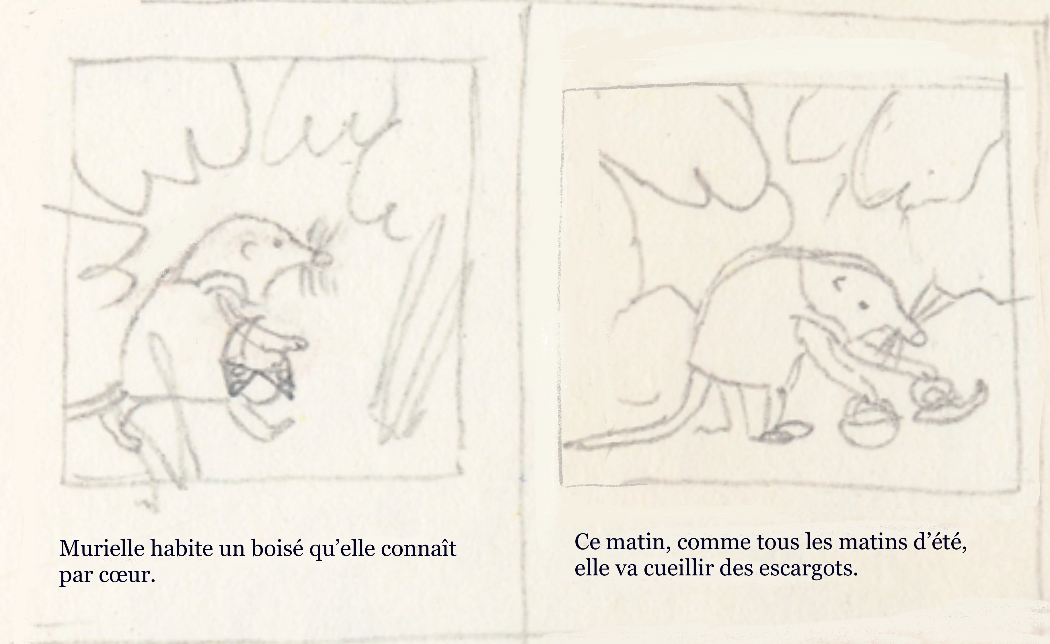
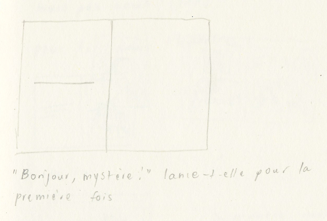
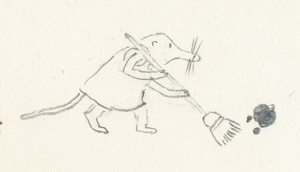
For Murielle, some of the work happened in this sketchbook:
It starts like this:
I had words - the next step was drawing.
But first:
Murielle: the playlist
I listen to music as I work, especially when I am storyboarding or revising - when I can’t listen to podcasts or audiobooks. Jacob (my partner) makes a playlist for every book that I work on. The one he put together for Murielle was just right. Maybe you’ll want to listen to it as you read this post. Here it is:
And here it is on Tidal, for those of you who made the move away from Spotify (we did!).
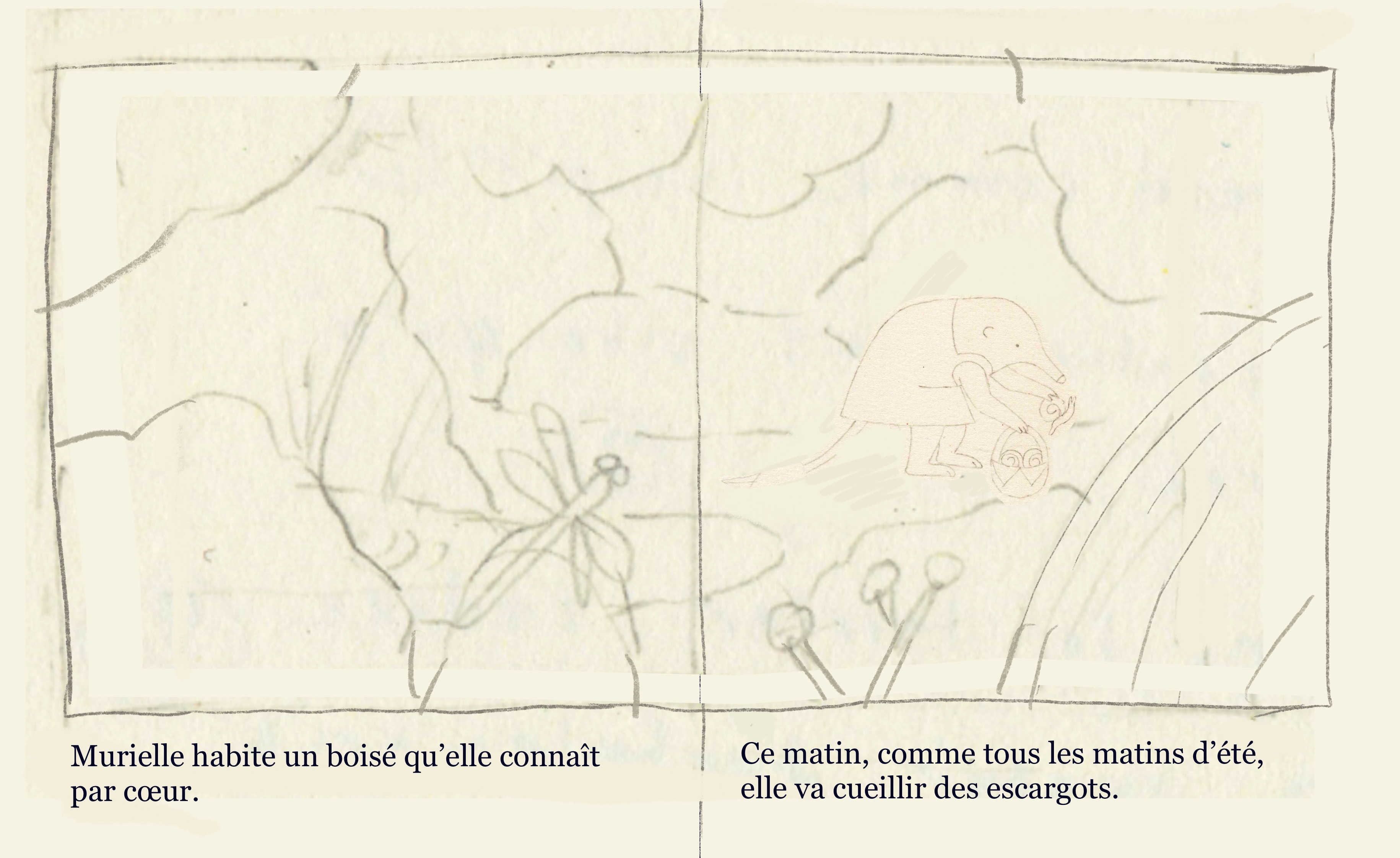
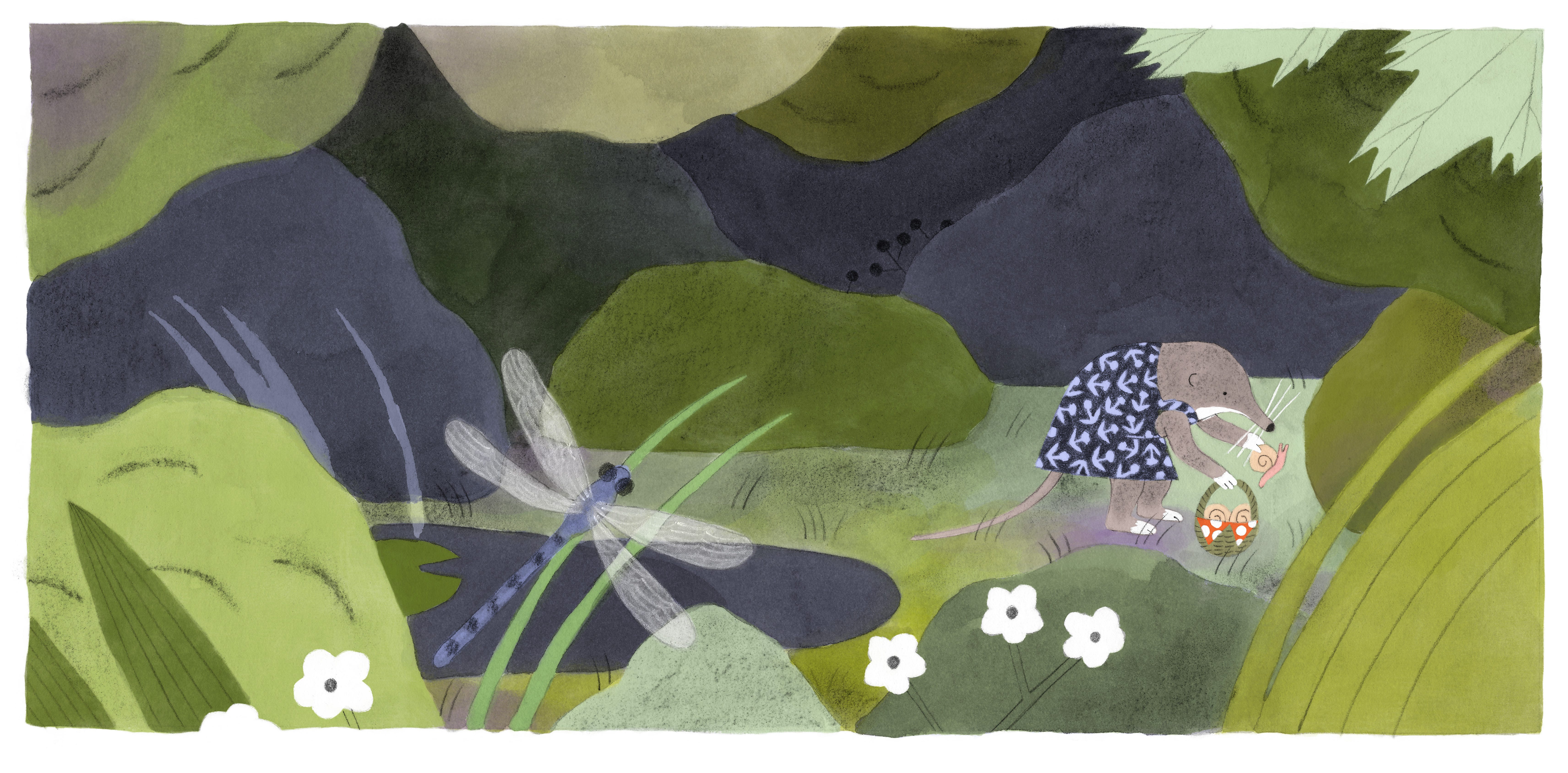
First images
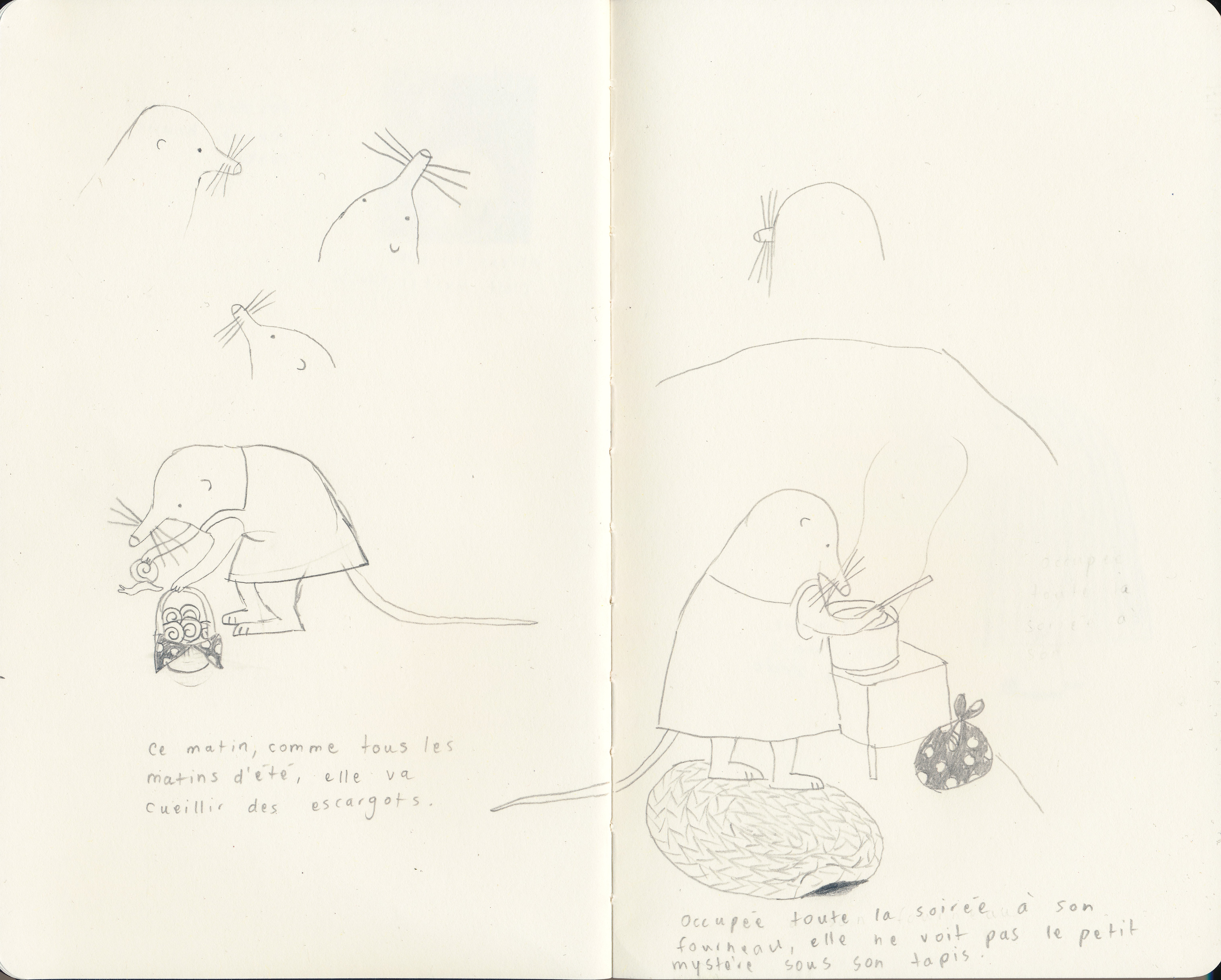
I started by drawing my character. She came easily. These are the first (and only) character studies I made. I drew a few shrew faces (above) that did not feel right, then I found her. I didn’t want to over-think (over-draw) her, so I left it at that.
First storyboard
Then, I drew a first version of the storyboard. I worked quickly and instinctively: it took me one day. Here it is:
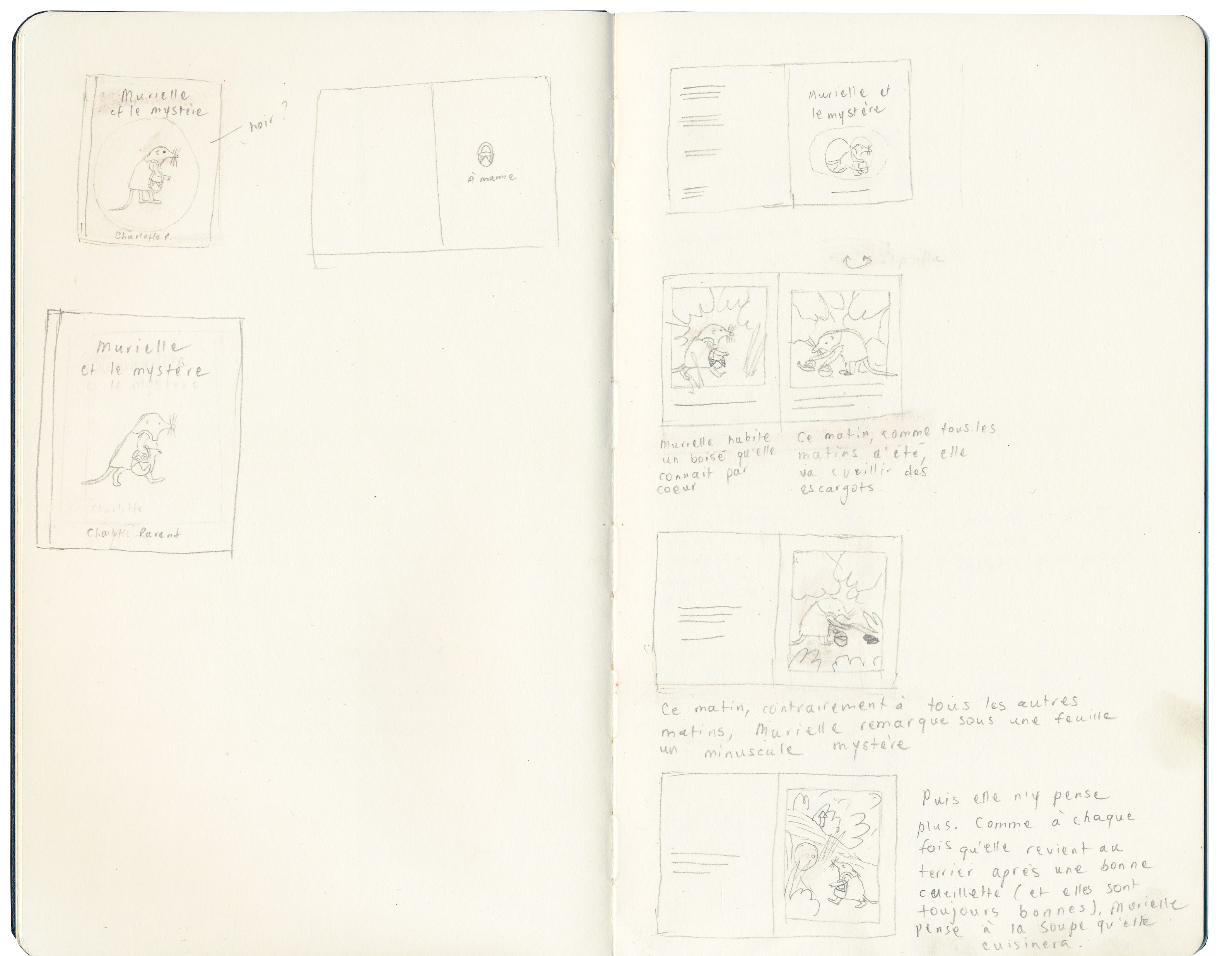
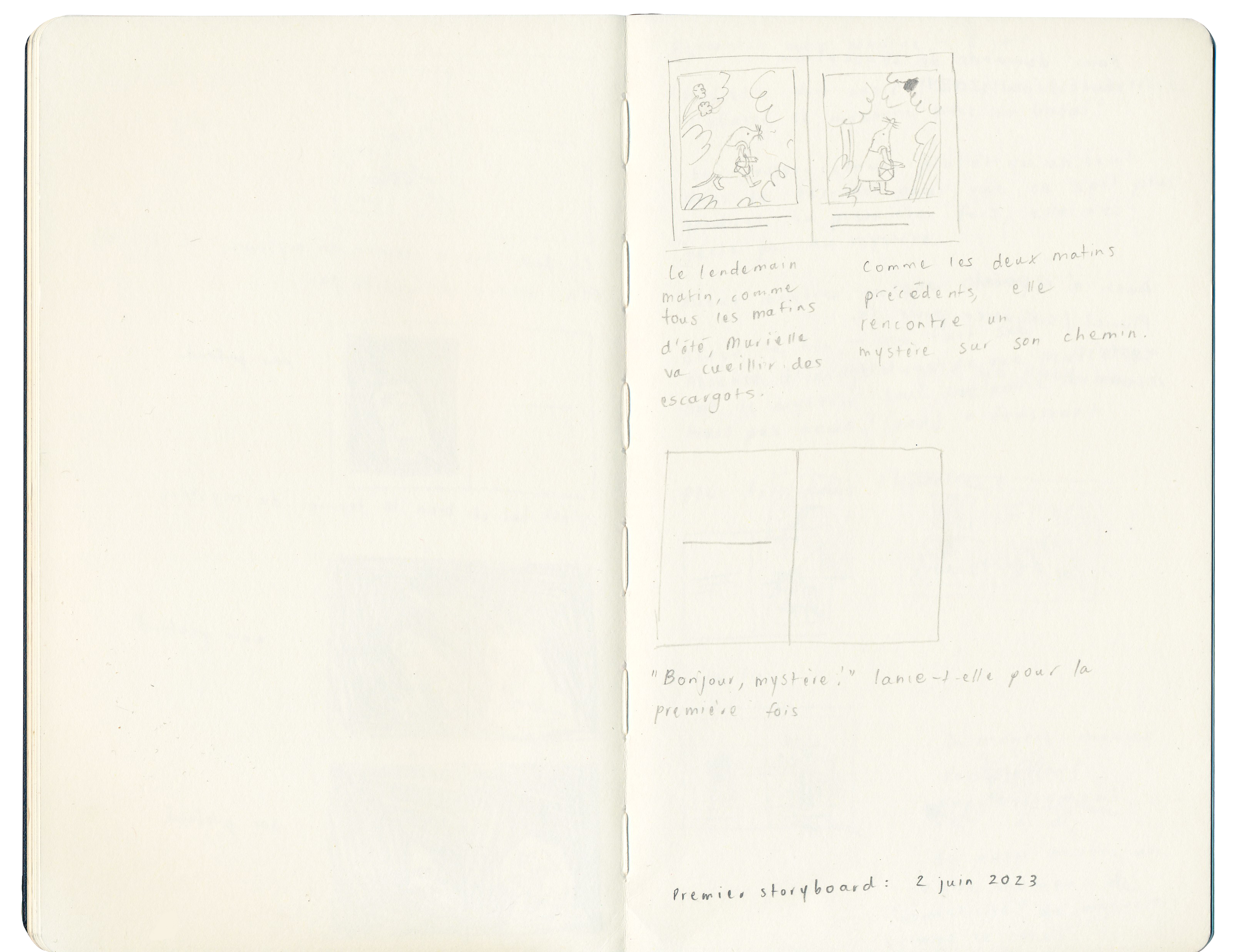
As you can imagine, this storyboard underwent some changes before it became the actual book. We’ll take a look at my revision process by going through a few key elements that I either modified… or refused to modify.
I am well aware that this book has not been published in English (not yet - *wink wink* ) and that most of you have not read it. I hope all of this talk of revising 1. still makes sense and 2. is of value to you.
Revising a storyboard
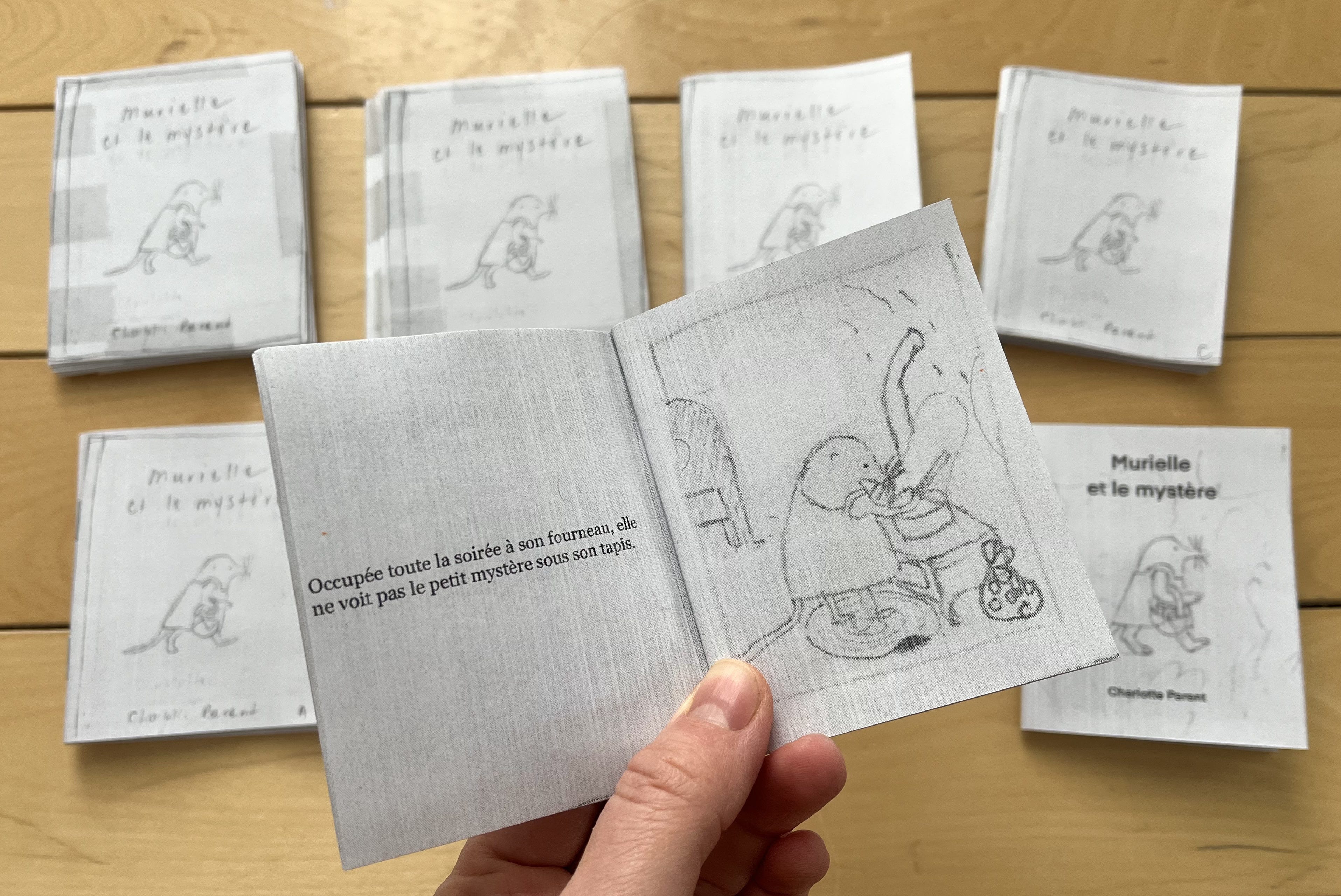
For this book, I was responsible for both words and images for the first time. I suddenly had so much more control over the story than I had been used to! I felt the need to make a tiny book dummy to evaluate how the text felt read aloud, how the images worked with the text, and how every page turn landed (or didn’t). I put it together on inDesign using the thumbnails I had drawn for the storyboard above.
As I noticed flaws (or as they were pointed out to me), I revised the text and the thumbnails, and, when it felt like I had a new “version” of the book on my hands, I made a new dummy. I made 10 altogether (8 at this stage - shown below, and 2 later on after creating the final illustrations).
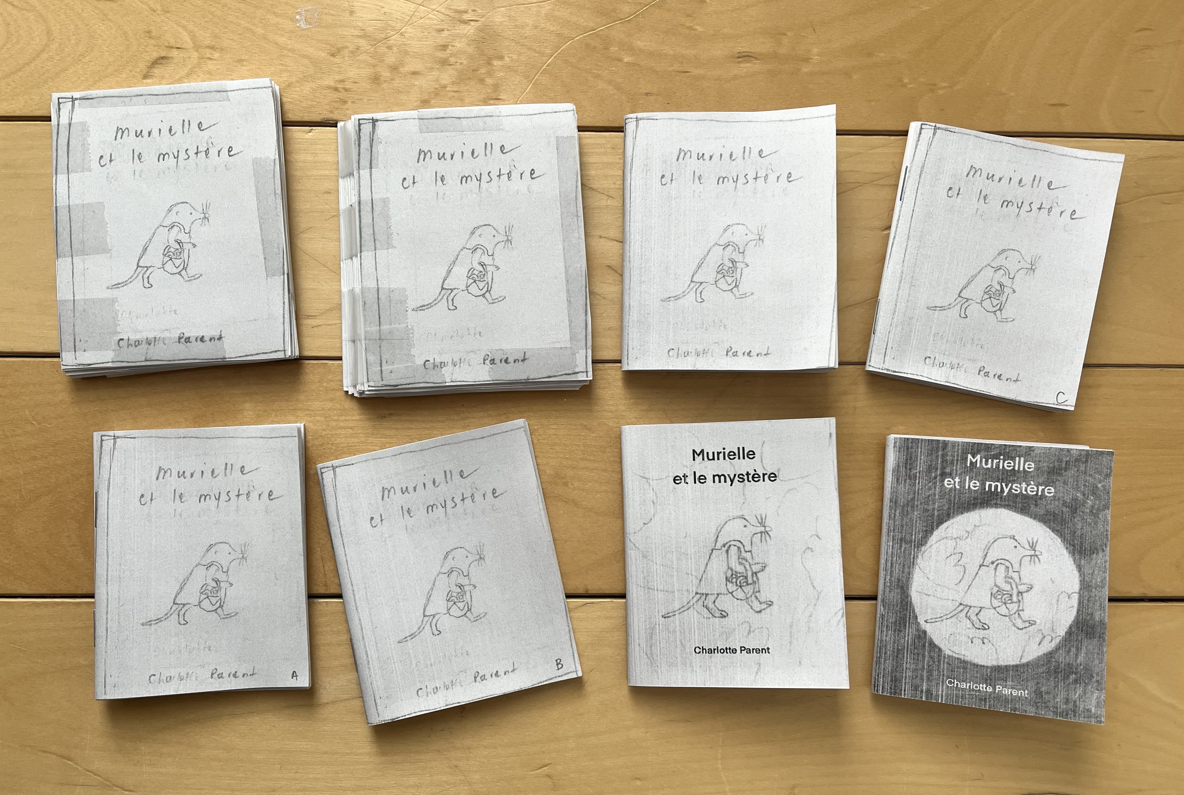
Once a dummy was stapled and trimmed, I would read it aloud, turning the pages, pretending I had never read it before, and observe my reactions as I did so. That’s how George Saunders describes revision - reading as a reader would, assuming that they would like the same things I like and be bored/annoyed at the same things I am. I think he talks about readers as “fellow sophisticates,” although I can’t find that quote anymore. I love this because in my case, the fellow sophisticate is a child, and thinking about revision in this way feels very respectful of children’s intelligence.
So here are a few things I considered during the revision and editorial process.
Variety
Some books I like to think of as cinematic - they have varied shots and angles, dynamic compositions, and full-bleed illustrations that immerse you in the world of the story. They are large-scale productions. This book, on the other hand, is a book that is very aware that it is a book (does that make sense?). It is very happy to stay within the confines of what is expected of a book. This first storyboard has very little bells and whistles. I was inspired by the way classic children’s books are laid out - maybe more specifically early readers.
The text and the illustrations are repetitive. I wanted them to be that way because that’s how Murielle’s life is.
My first storyboard had full-page illustrations with a white frame around them, with the text either below them or on the opposite page. It’s comfortable, familiar territory, and remindful of Murielle’s domestic and well-defined world. I used only tight framings, because I wanted the book to create a feeling of coziness and intimacy - and maybe also of confinement. Murielle’s humdrum world resists variety and expansion.
I also resisted variety and expansion for a bit when my editor asked for it.
I did end up opening it up a little bit eventually, and the changes made the book better, I think. Here are some notable ones.
I changed the first pages so that the book opens on a spread, as recommended by my editor.
I changed two unconnected illustrations on opposite pages into a kind of false spread - there’s a white border and a passage of time, but it reads as one image. It felt like a subtle play on the classic layout I was so attached to.
I had a lot of fun doing that and thought it worked really well, so I made a few more of those false spreads.
I made a key moment into a full spread to give it more gravitas. I love the final illustration for that spread - I’m so glad I made the change!

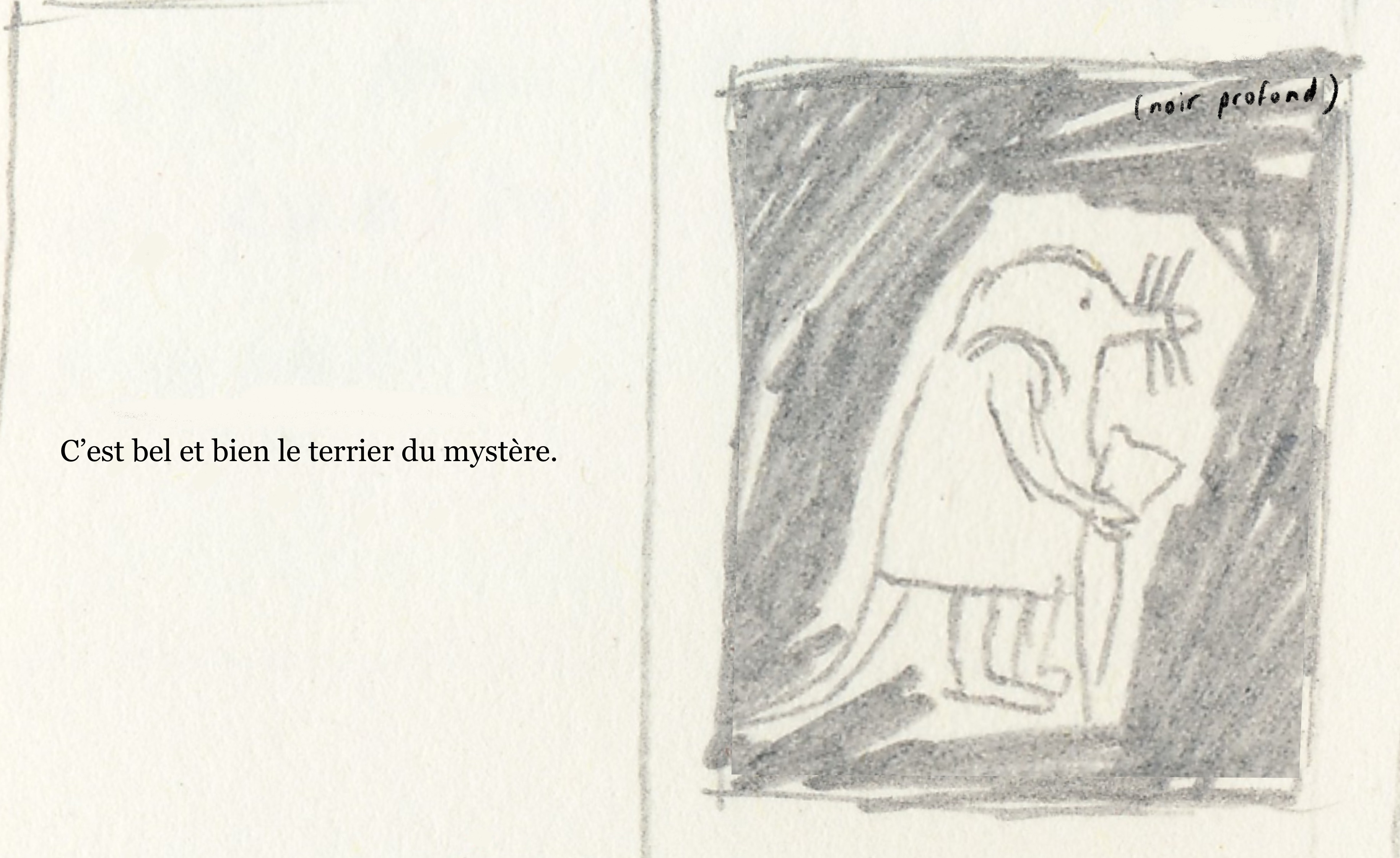
I switched this illustration from a side view of the character (like most illustrations in the book) to a POV illustration. I love that it’s spookier.
Spelling out emotions
I got feedback that suggested clarifying how Murielle feels at various times in the book.
The text does not state how Murielle feels throughout the story, and the illustrations leave room for interpretation. So I get it. But I did not want to add words like “worried,” or “angry” because it felt like it would be limiting. I trust children to add a layer of richness to the book by interpreting Murielle’s emotions through the lens of their experience - just like any other reader.
I like what Jon Klassen said about (not) depicting emotion in an interview:
There is something in cinema called the Kuleshov effect, and the basics are that if you’re shown a character with a relatively blank expression, and then the movie cuts to something they are meant to be looking at, you, as a viewer, can’t help but relate the two images and think that the blank expression is actually expressing something about the second thing you were shown. For instance, the movie would show the blank expression and then it would cut to show a sandwich, and then show the blank expression again, and then show a baby, and show the expression again and then show a coffin. And every time you, the viewer, would do the work of thinking “oh he looks hungry now / loving now / sad now.” We, the audience, like doing this. We actually kind of have to do it. The adjustment I make is that instead of cutting two images together in sequence, I put some text next to a picture. So you show a blank-expression bear and you say on the facing page “This bear has lost his hat.” The bear’s expression is still blank, but now that you’ve read the words, he looks devastated. I think there is SOME drawing involved, like you want just the right KIND of blank expression, but there’s a lot less of me, the illustrator, and a lot more of you, the viewer, going into it than you’d think.1
I believe in that! I don’t believe in telling the reader (not even a child - especially not a child) exactly what to feel.
What even is poetry?
I was told at some point that the text “lacked poetry”. I had trouble with that feedback because this book felt so inherently poetic to me. I did want this book to do for the reader (my fellow sophisticate!) what poems I like do for me - they give me little jolts of… something.
I think the person who made that comment felt that the language in the book was too simple and repetitive. They suggested adding adjectives here and there and getting rid of some repetitions. I resisted that. I think poetry can be simple; to-the-point, even. It felt like this story demanded this level of simplicity. It felt to me that the poetry was in the text serving the story just right, rather than in “poetic language”.
This comment had me thinking about what even poetry is for weeks (please share any good definition you know in the comments!). Can poetry be unpoetic? I talked about it with poets I know. I read more poetry than I usually do. My brother recommended that I read Mathieu K. Blais’ Tabloïd because of its relatively simple language. In it, every poem starts with “Chaque matin” (“every morning”). It comforted me in my resolve to keep the repetitions as they were.
To be honest, and maybe a little overconfident, I still think Murielle is poetry enough.
Text-image relationship
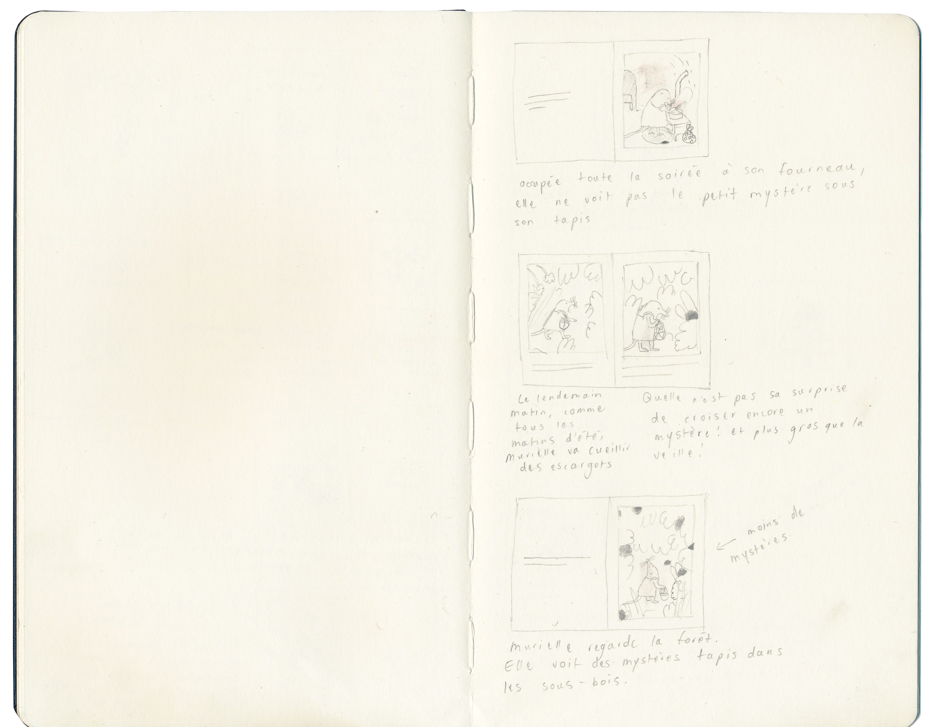
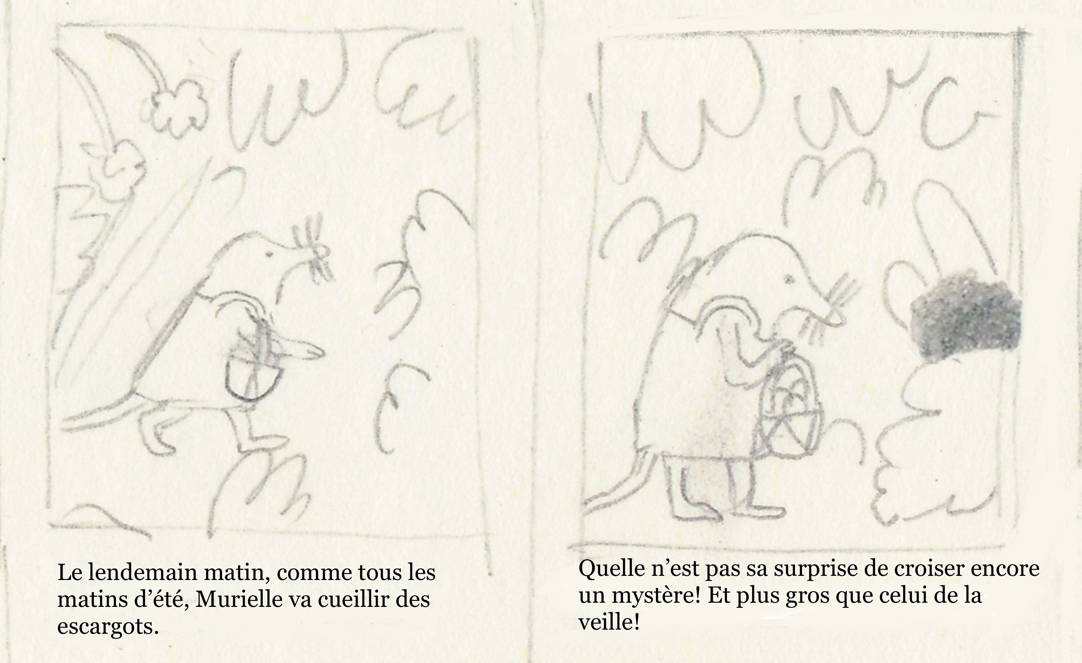
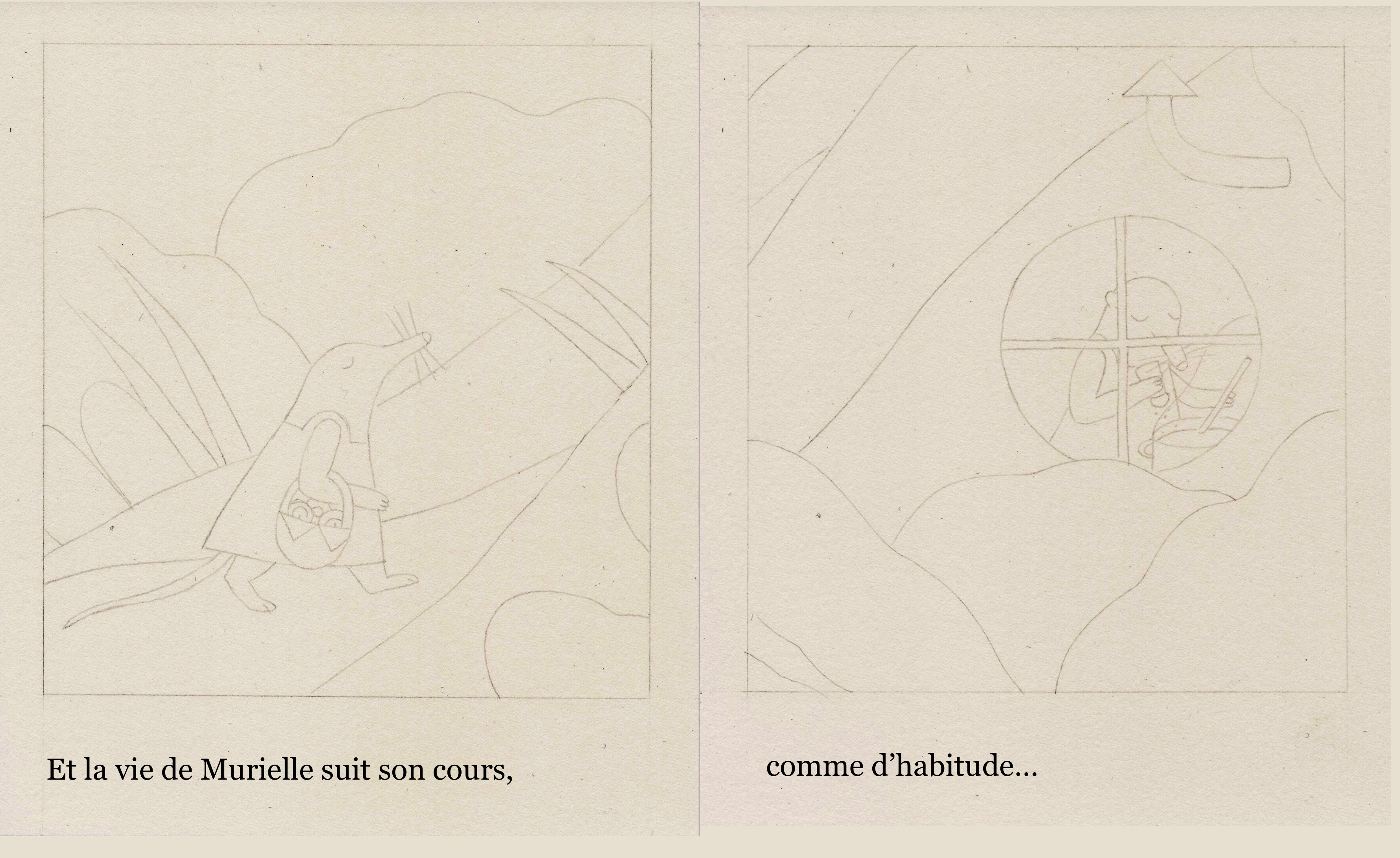
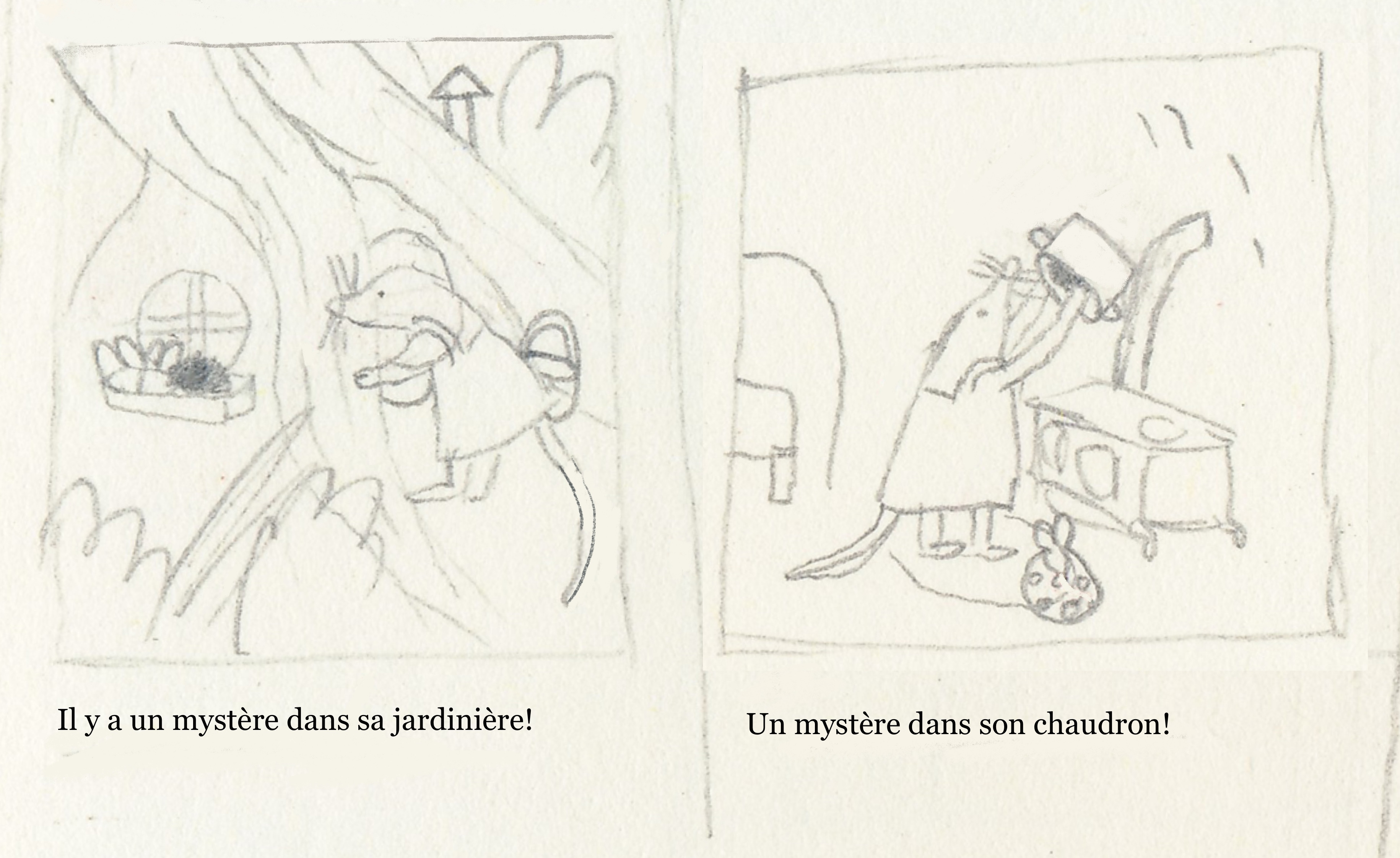
I’m always on about text-image relationship, yet I only realized very late into the revising process that, on some pages, the text and illustration were repeated beats and did nothing fun or interesting. I kept showing the mysteries in the illustrations AND mentioning them in the text, for no good reason.
For example:
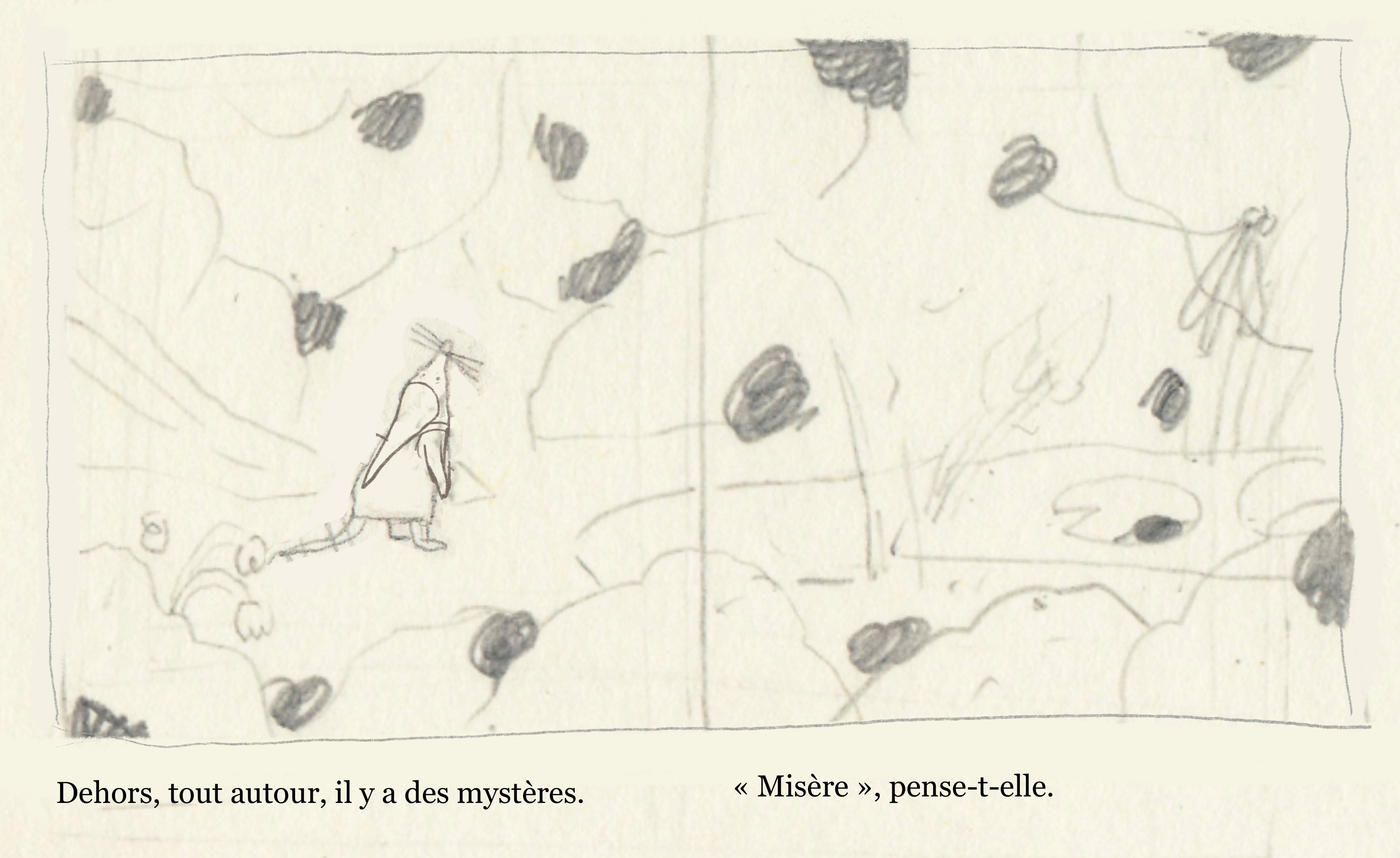
This is boring!!! There’s no tension between the text and the image. There’s no reason to even mention the mysteries outright in the text - they’re visible in the illustration. I changed the text to this:
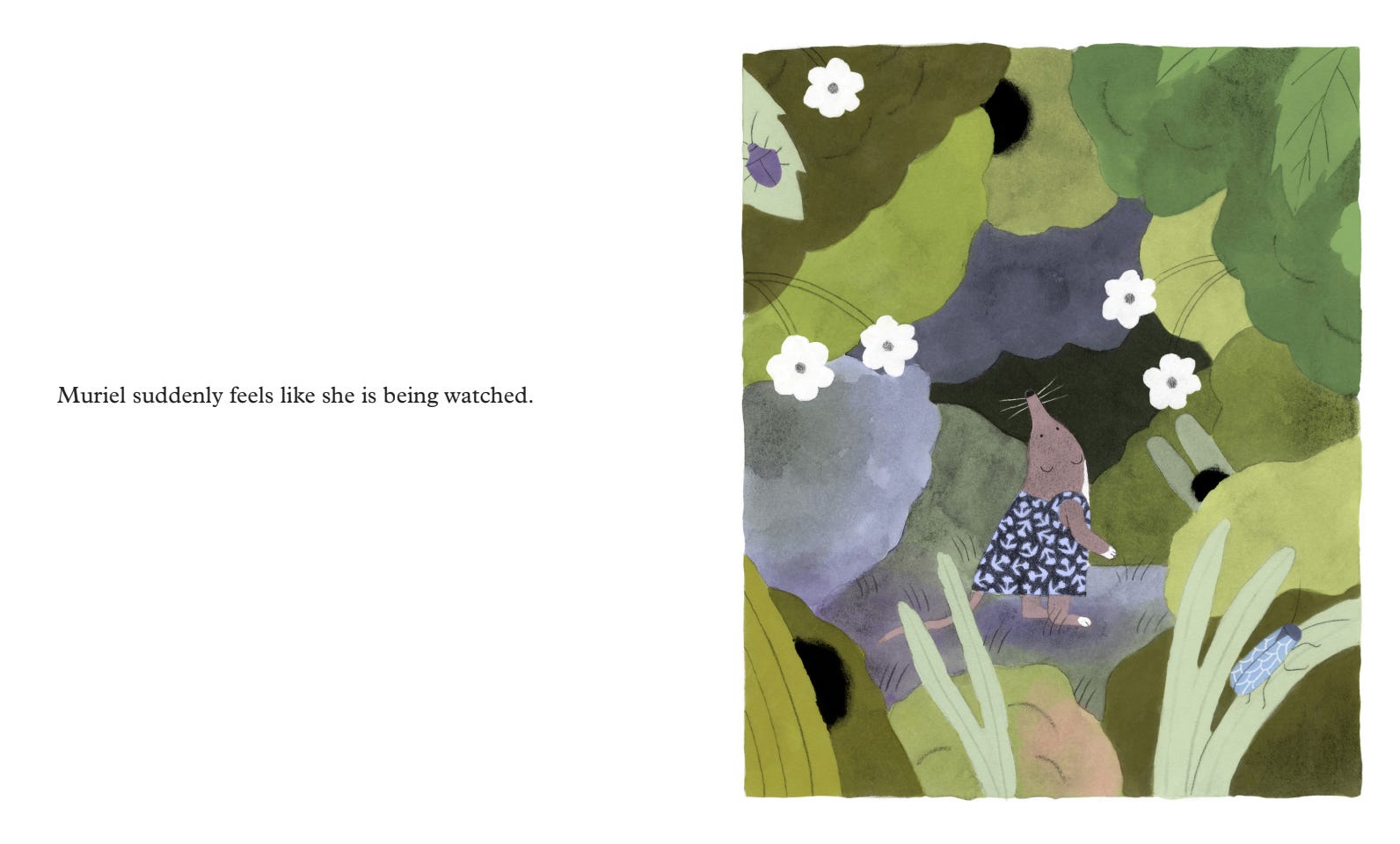
It works so much better. And I know children will love to spot the mysteries - and feel good about spotting them because, although even the text doesn’t quite know what’s going on here, they figured it out.
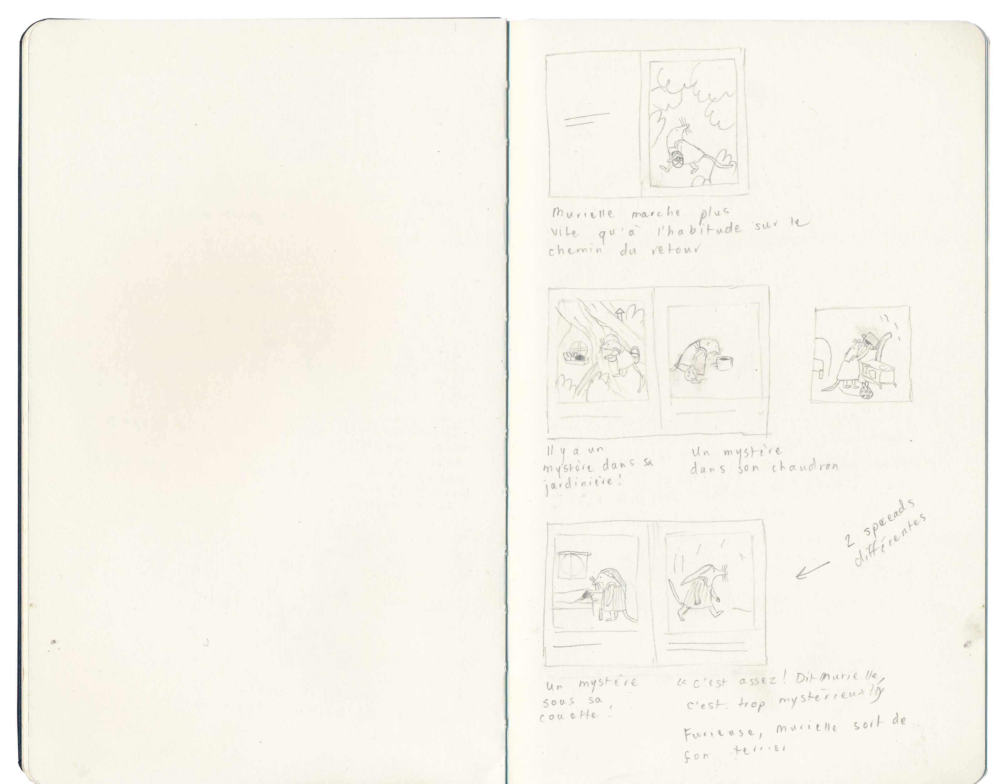
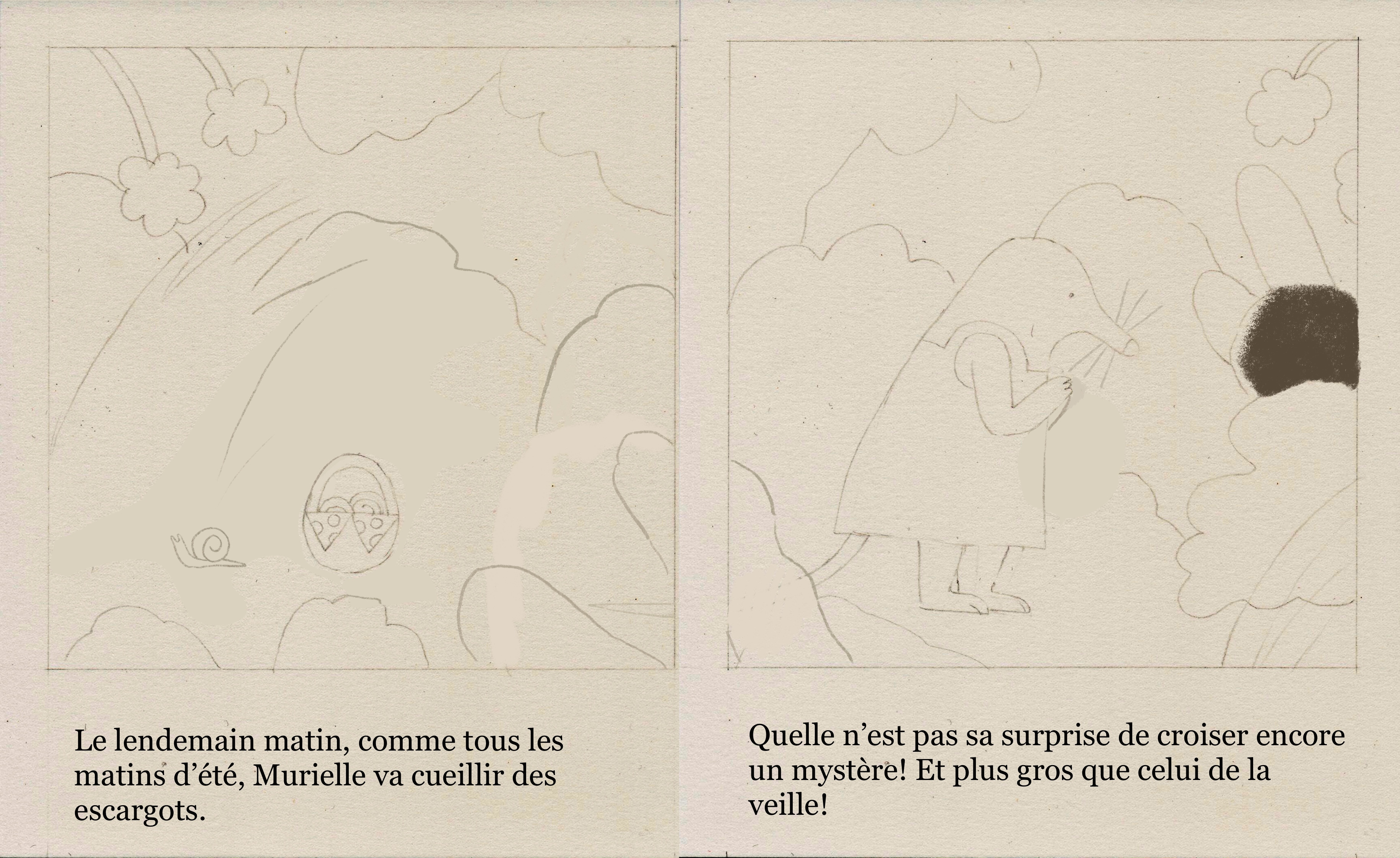
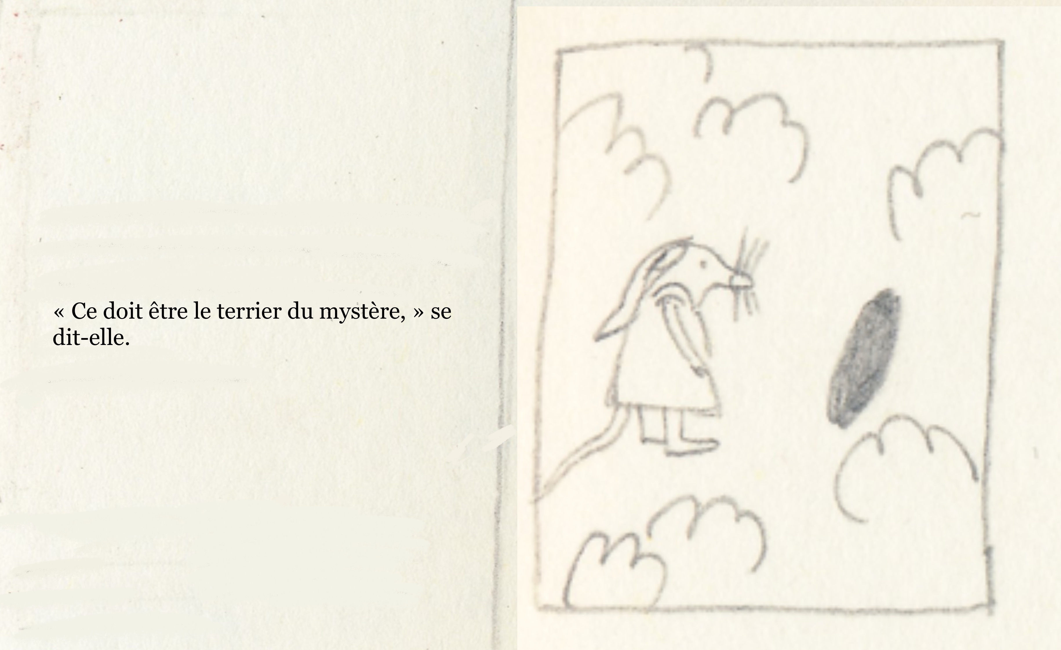
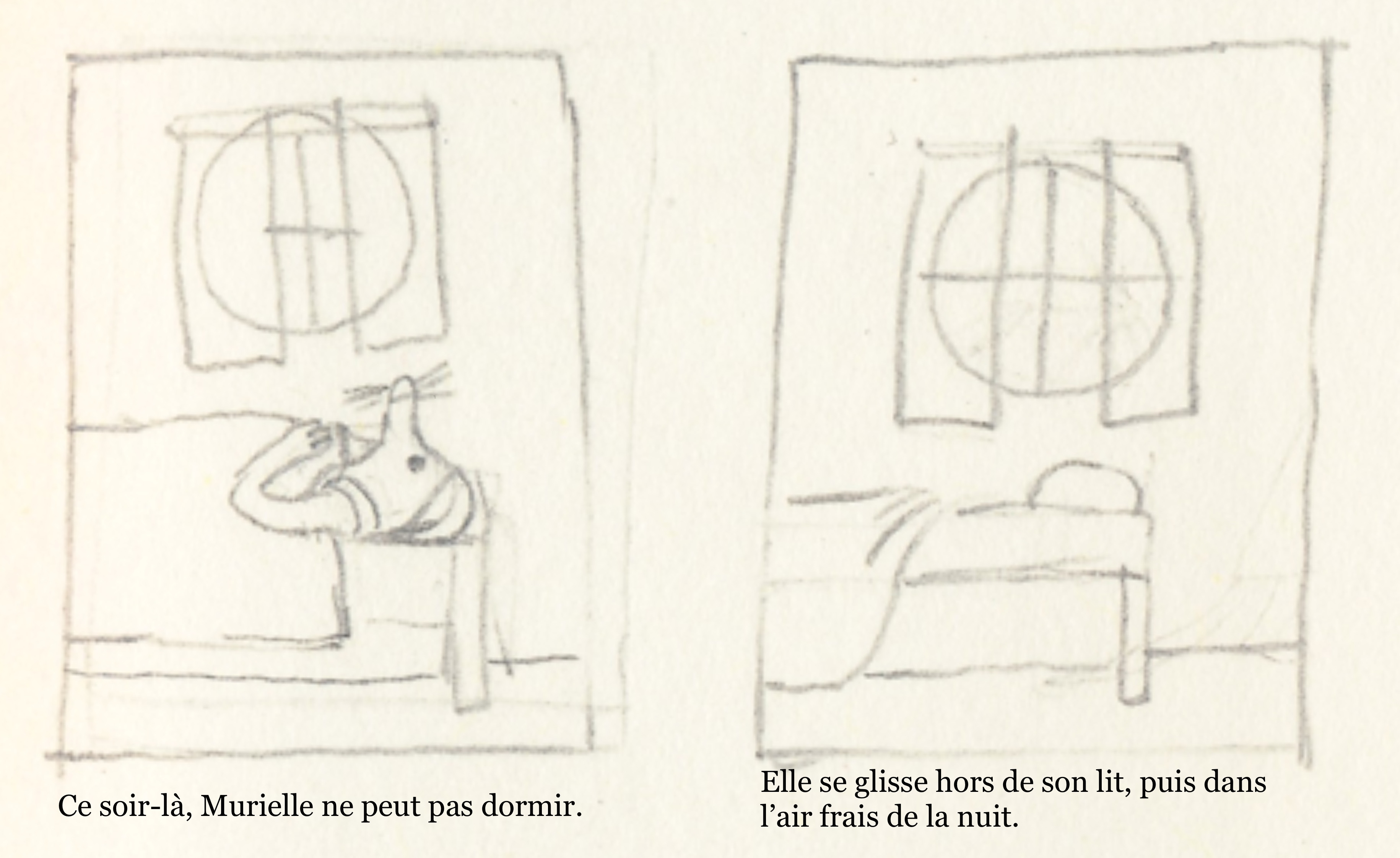
Here is another similar example:
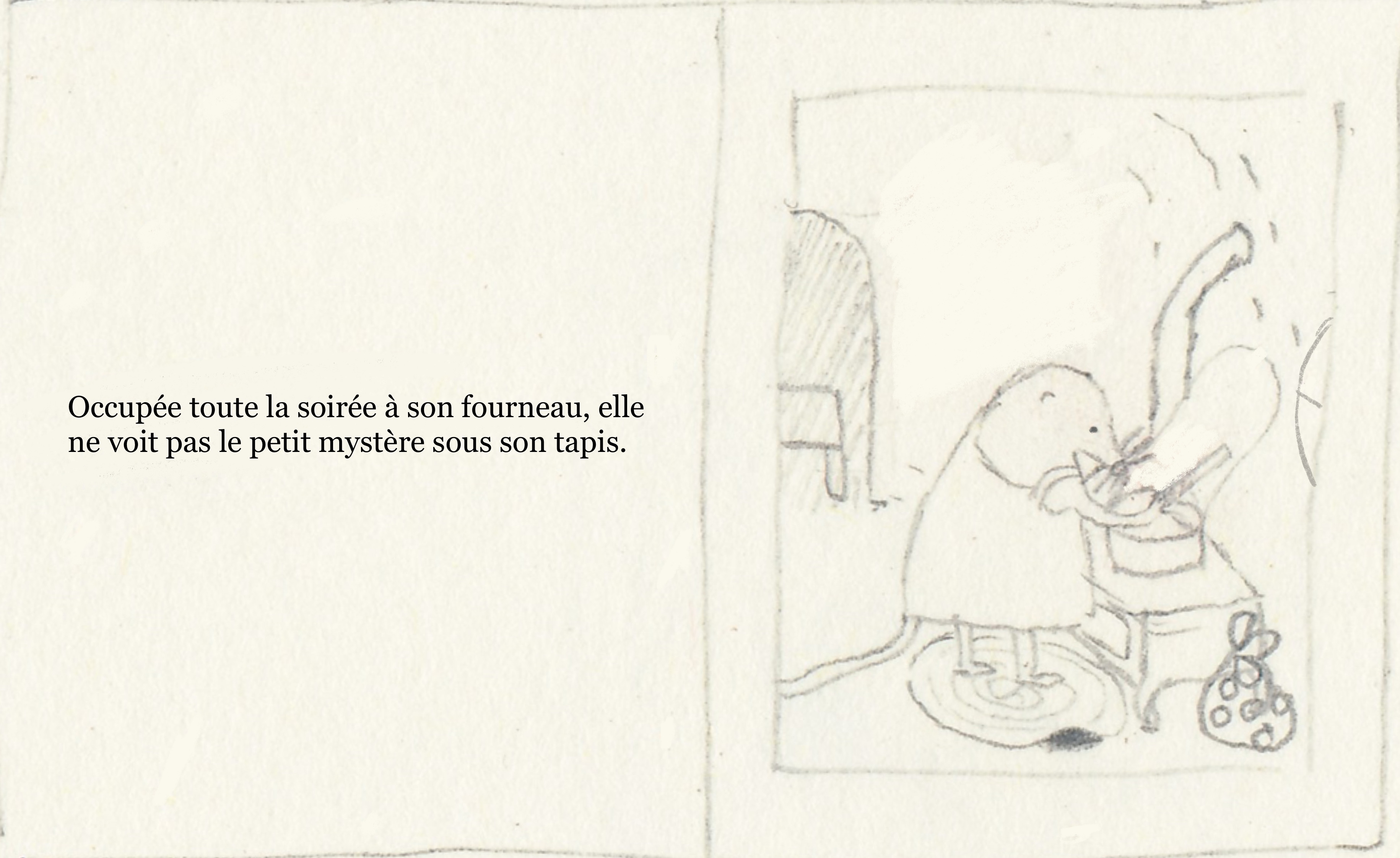
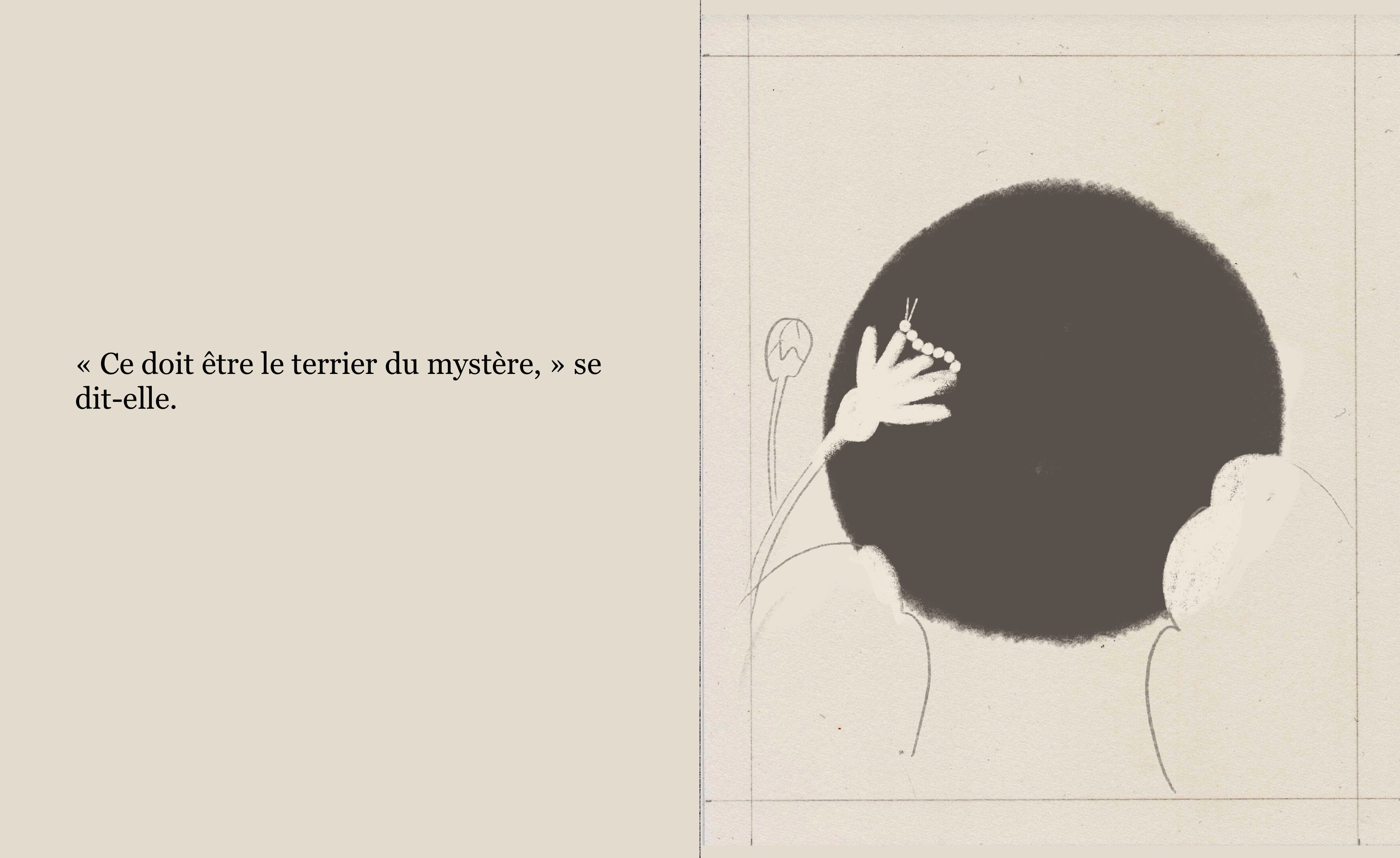
I changed it to this:
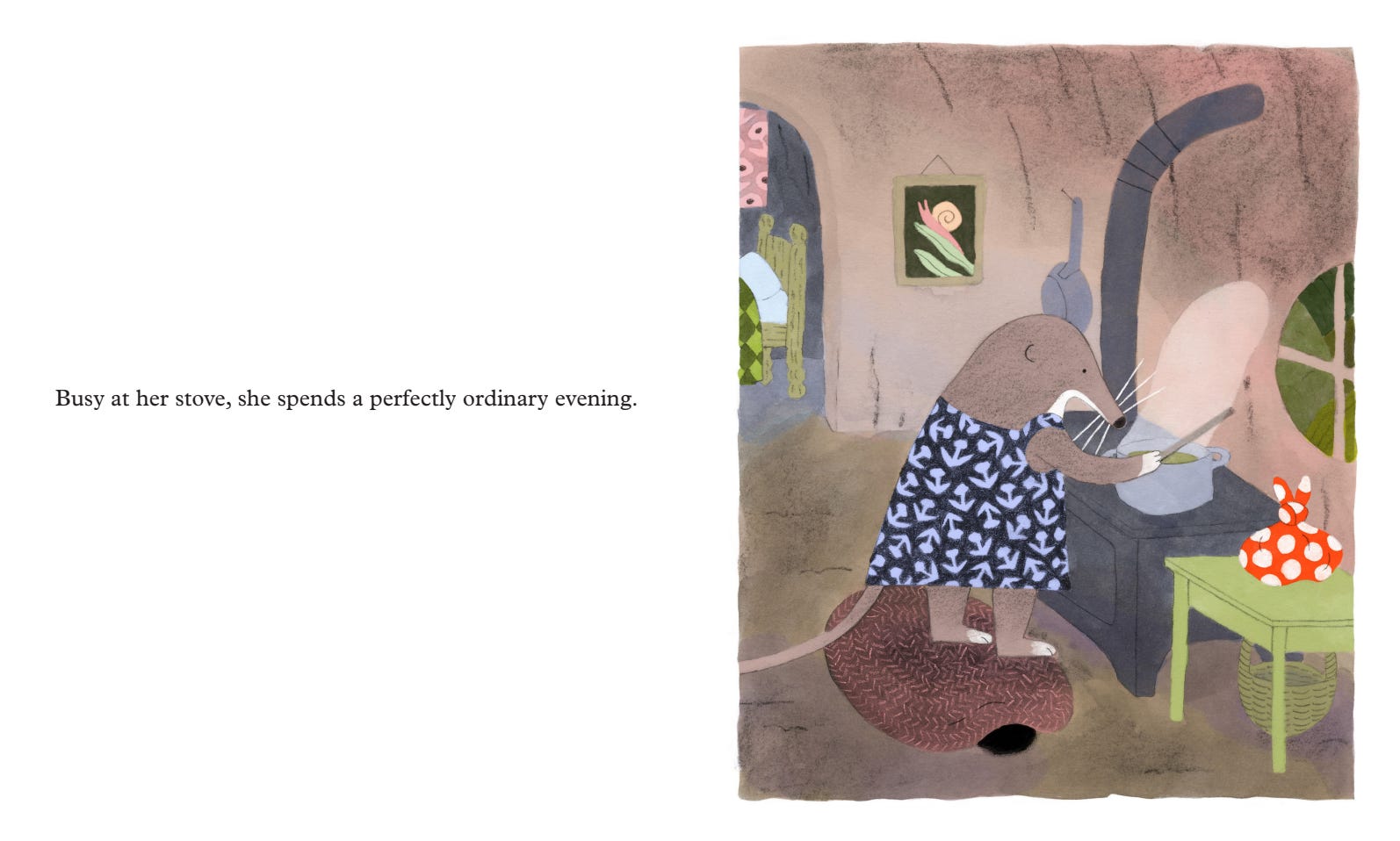
Now, there is tension between the text and image. The text says, “This is a perfectly ordinary evening, nothing to see here” but the image says, “look closer.” Now the reader is working for me - especially her little finger pointing right at the mystery under the rug.
The ending
As you can expect, now is the time for a SPOILER ALERT. I don’t mind spoilers for picture books, really. But if you do, you might want to skip this section.
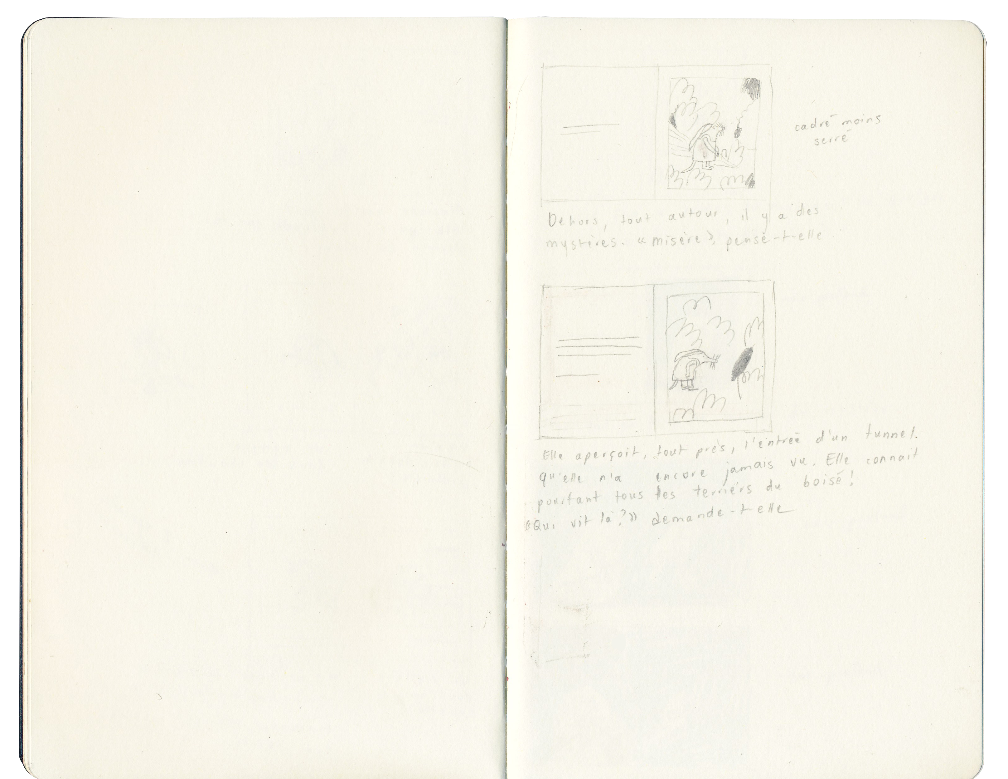
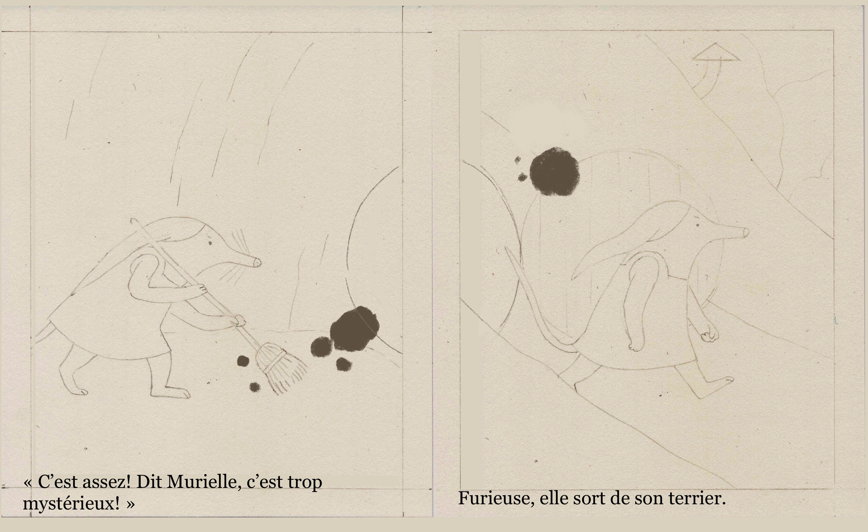
In the original version of the text and storyboard, after Murielle has tea with the mystery, she meets it again on her way to gather snails the next morning. The next (and - at the time - last) spread went like this:
I liked this ending because it was very open as to what Murielle’s relationship with the mystery would be from then on. The key, to me, was the words “for the first time” - they imply that she will greet the mystery again in the future, maybe even make it part of her routine. It seemed like she was starting to accept it as part of her world, but to what extent that was true remained for the reader to imagine. That’s why I had that last line on an otherwise blank spread.
My editor was not having it, though. She thought the loose ends needed to be tied up in order for children to not be disappointed at the end of the book. (I disagreed.) But she also said that she found that last spread potentially frustrating because it felt like Murielle was seeing the mystery under some other form (its true form) but that I was withholding that information from the reader by not illustrating it. I was very concerned about this reading: first, because it is important to me that the mystery remain just that (there is no “solving it”, no “true form”), and second, because it felt mean to the reader.
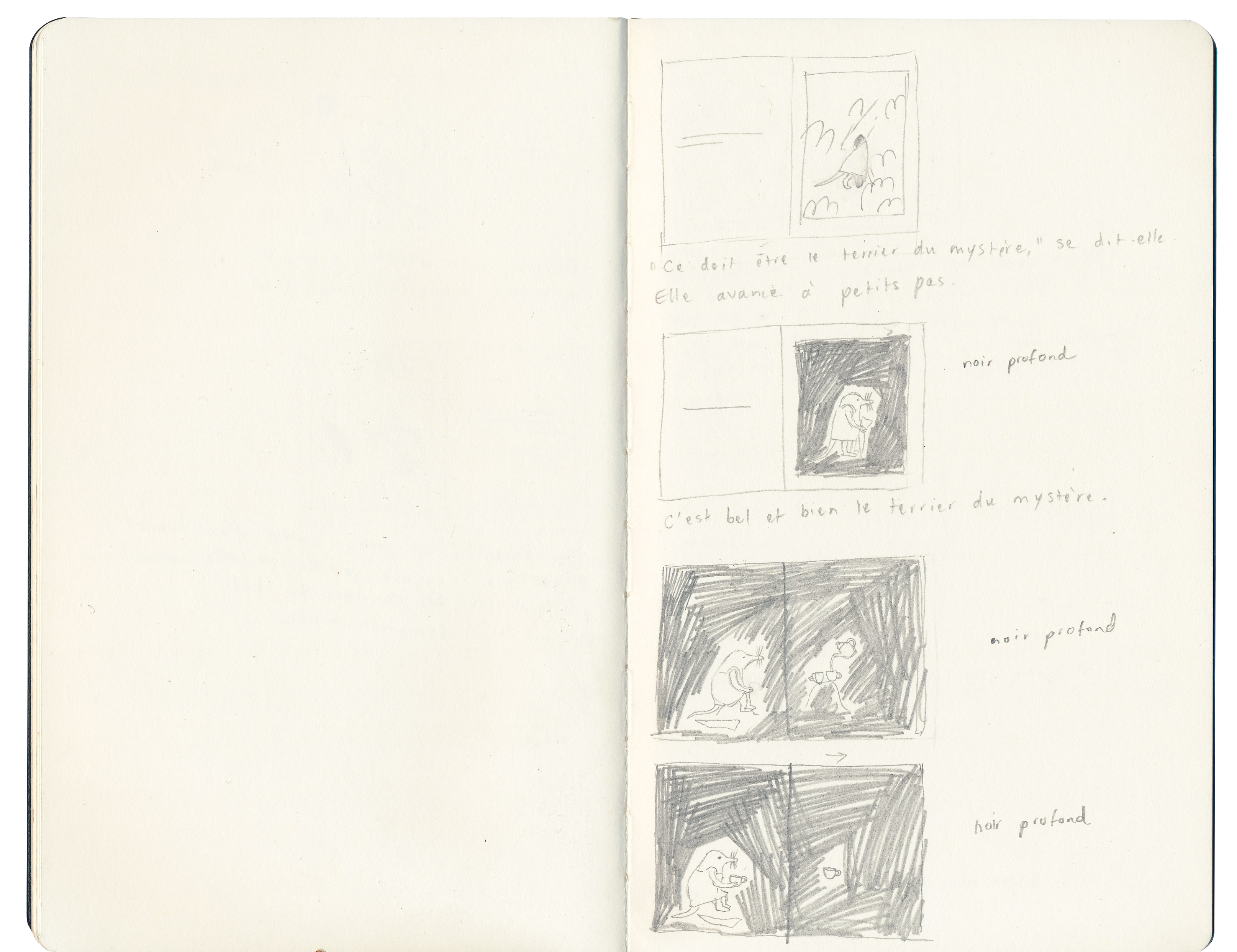
So, I had to revise the ending. I thought I could add a few beats, take it just a little bit further while still keeping it very open. That’s when I thought of the dinner scene:
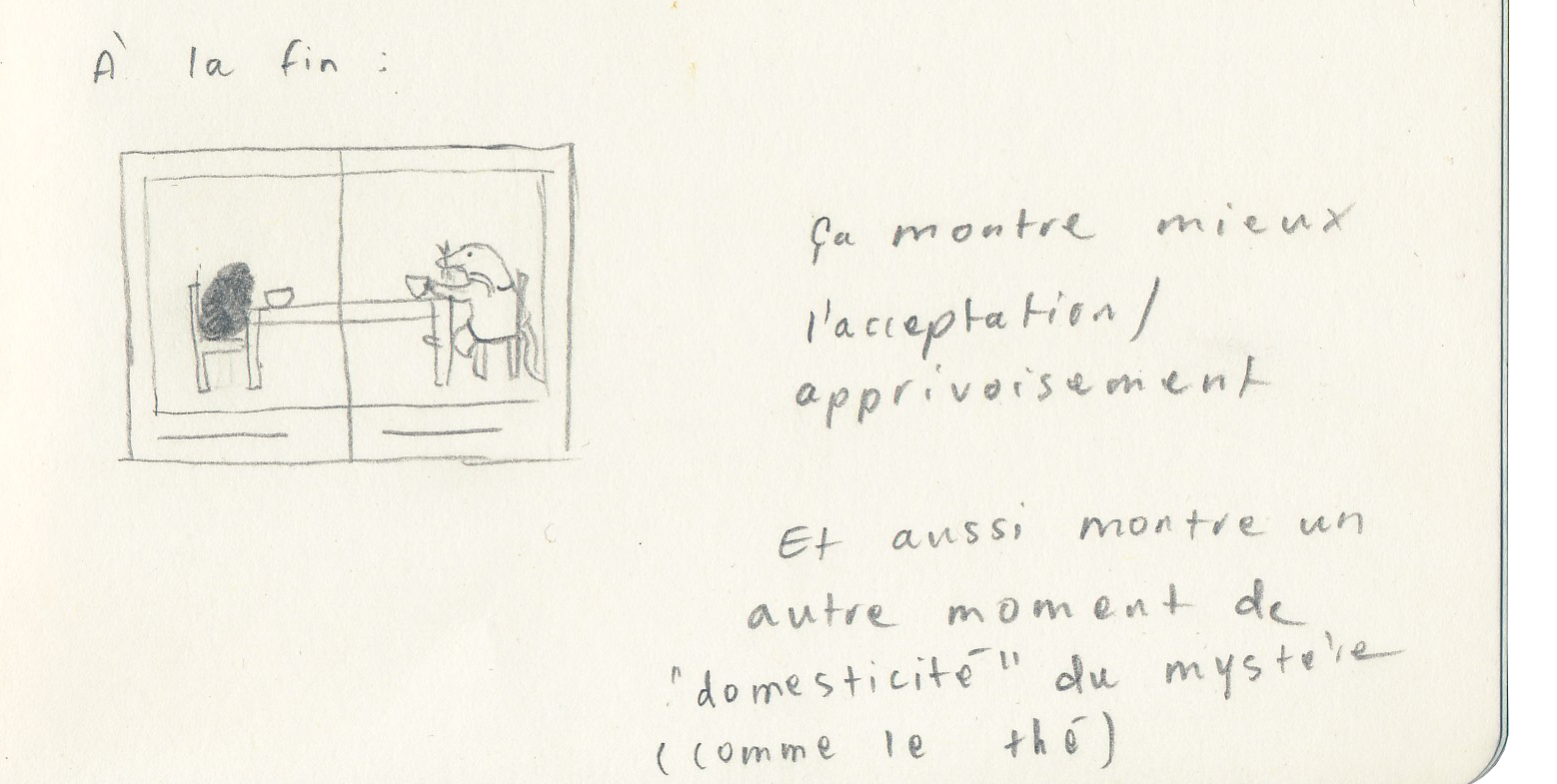
It went a bit further towards showing that Murielle is accepting the mystery (she’s sharing her beloved soup!). It also shows the mystery in another moment of domesticity, like the tea scene. That felt very satisfying and right. It felt like something the story could grow into naturally.
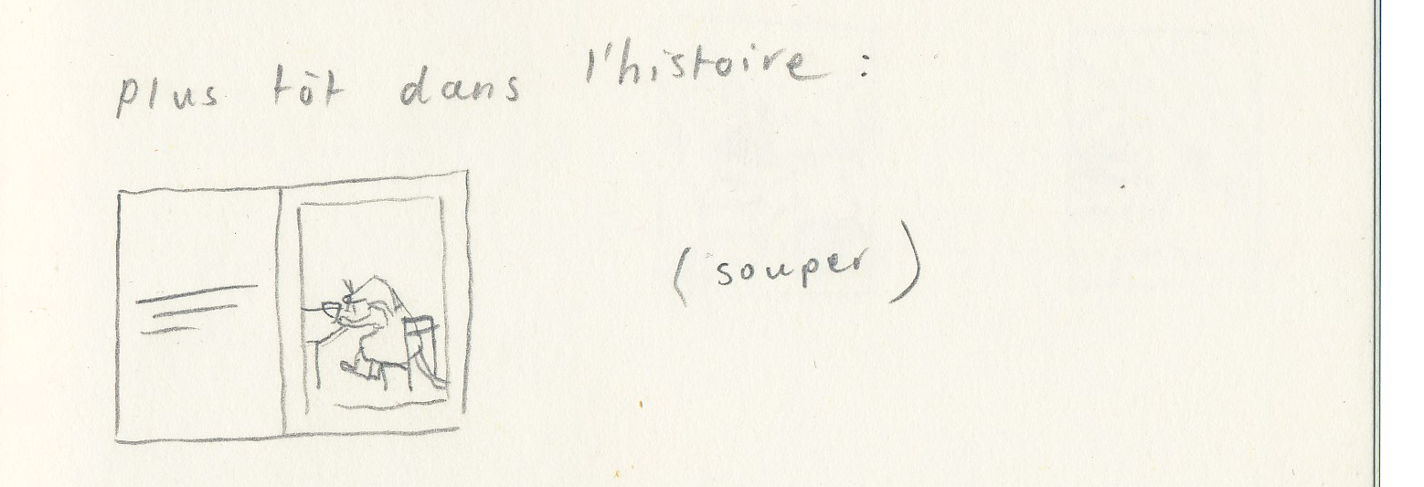
In order to make that beat land better, I decided to plant the seed for it early on in the book, by showing Murielle having dinner on her own at the beginning of the book:
The book now ends with that dinner scene. It remains fairly open - Murielle’s expression is inscrutable and she seems a little tense. It feels like an optimistic but honest ending.
That’s it for now! In the next post, we’ll talk about finding the right medium for this story.
Can you tell what I used to make the final illustrations? Let me know me in the comments!
Thank you for (still) being here.
https://orionmagazine.org/article/duck-chair-bone-suspense-a-conversation-with-jon-klassen/
this was such a gift of a follow up to part one!!! your reference of Jon Klassen's reference of the Kuleshov effect has been real food for thought for me, and your navigation of how to tow the line on holding your principle/perspective on the sophistication of children when it comes to emotions not being reduced to :) and :(
I studied animation and we were taught about the Kuleshov effect and so my approach to picture books has had this carried on it's back, but feedback to my picture book portfolio was unanimous in pushing for clear exaggerated emotion for kids to be able to read. As I'm just starting out I want to take feedback face on, but it's been encouraging to read how you've went about this and held your ground! definitely has me thinking about where I want to draw the line in my own work more confidently, so thank-you!
p.s do you like your printer ? if yes what printer do you use, I found scanner hunting easy but printers are quite daunting for some reason... maybe a childhood full of seeing them chew up paper and shout about ink haha!
I loved reading this! Thank you! 💖